ODE Studios
Visual Identity
We were recently approached by ODE Studios to create a new Visual Identity for them, informed by a Brand Strategy that was produced by our colleagues at Rosie Lee Group. Producing an in depth Brand Strategy alongside a new Visual Identity ensures a cohesive, recognisable and flexible brand experience for our client.
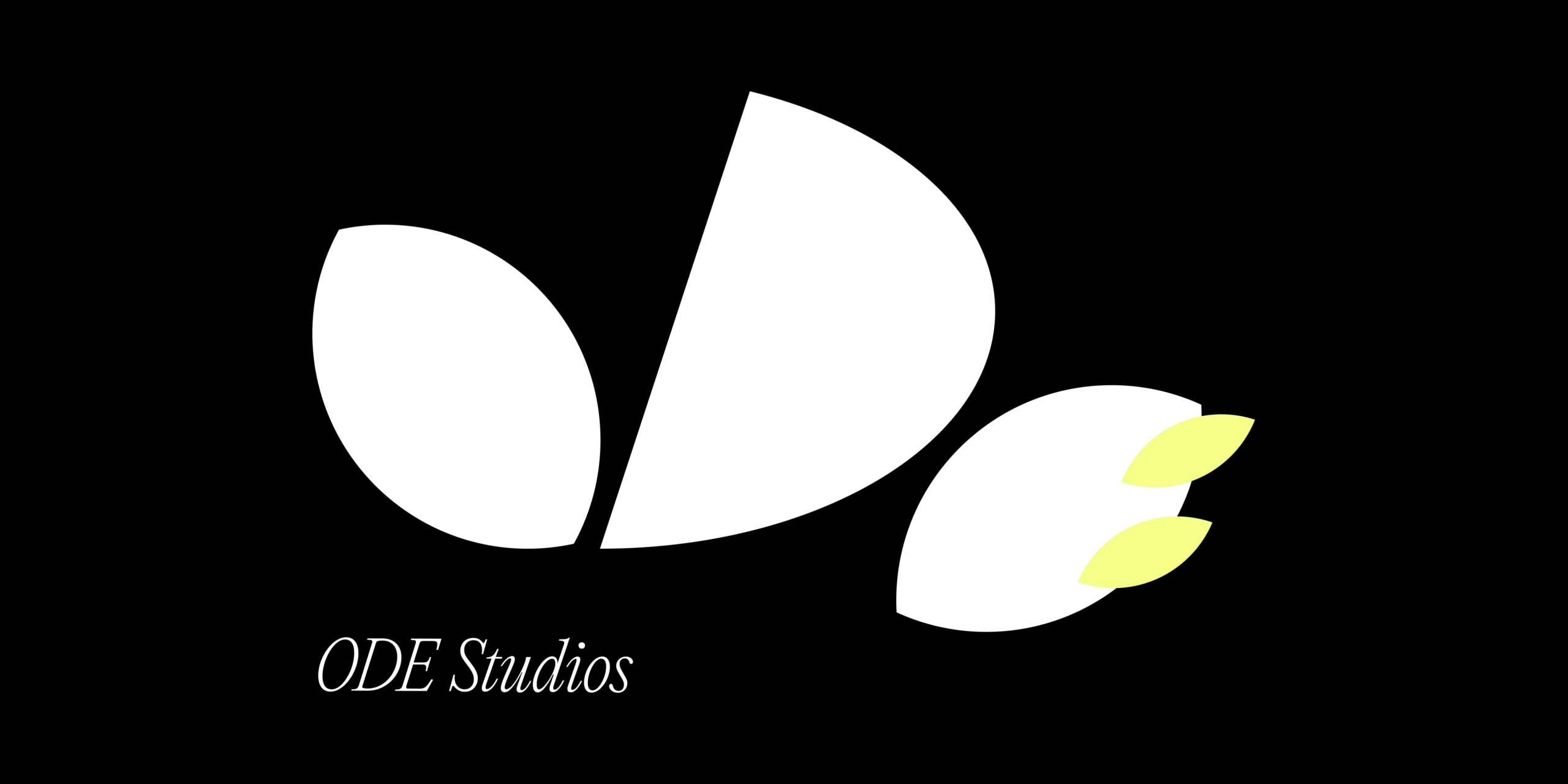
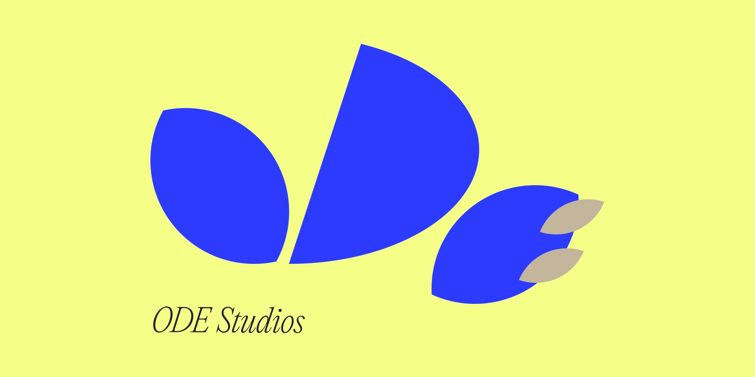

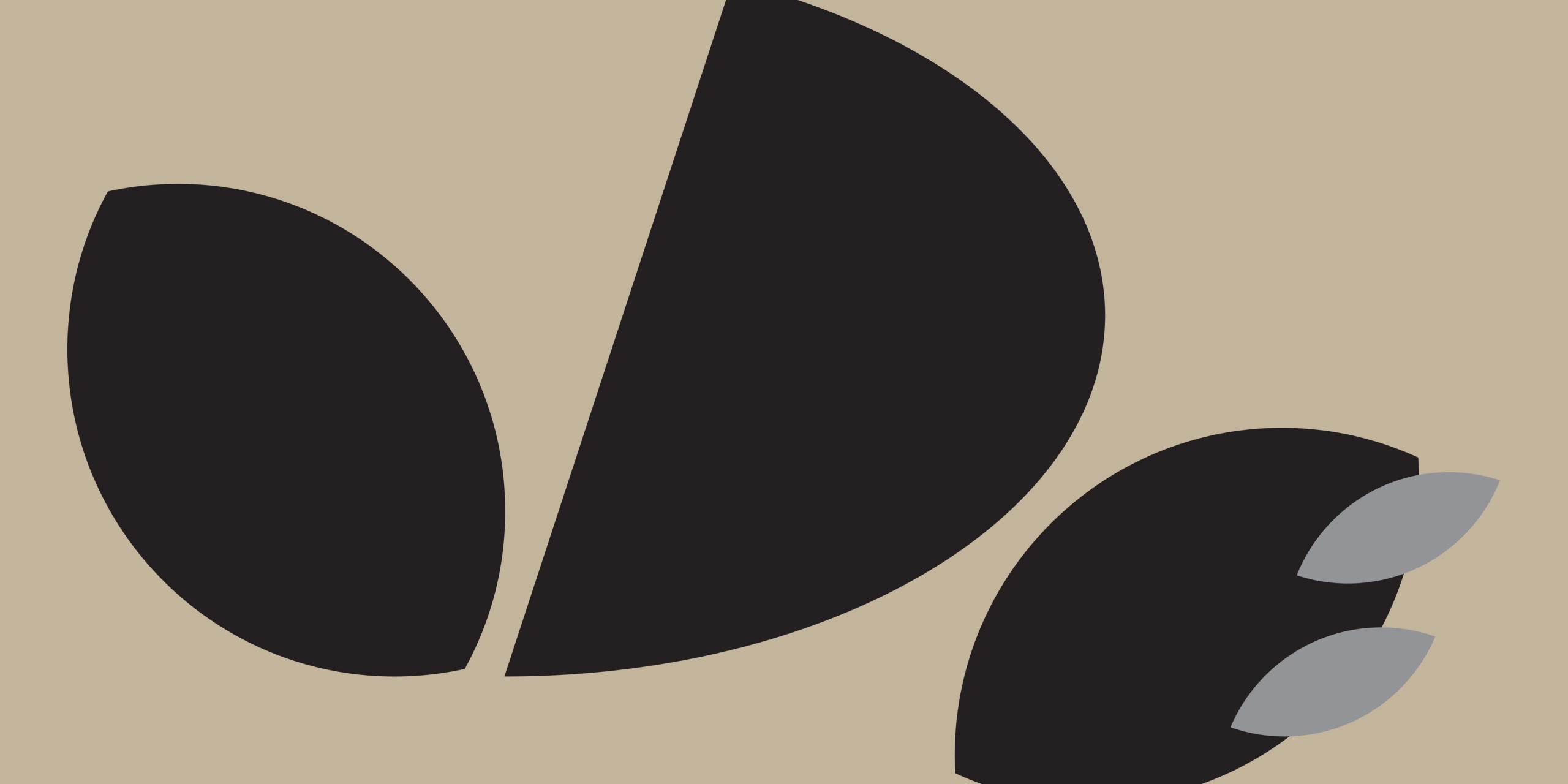
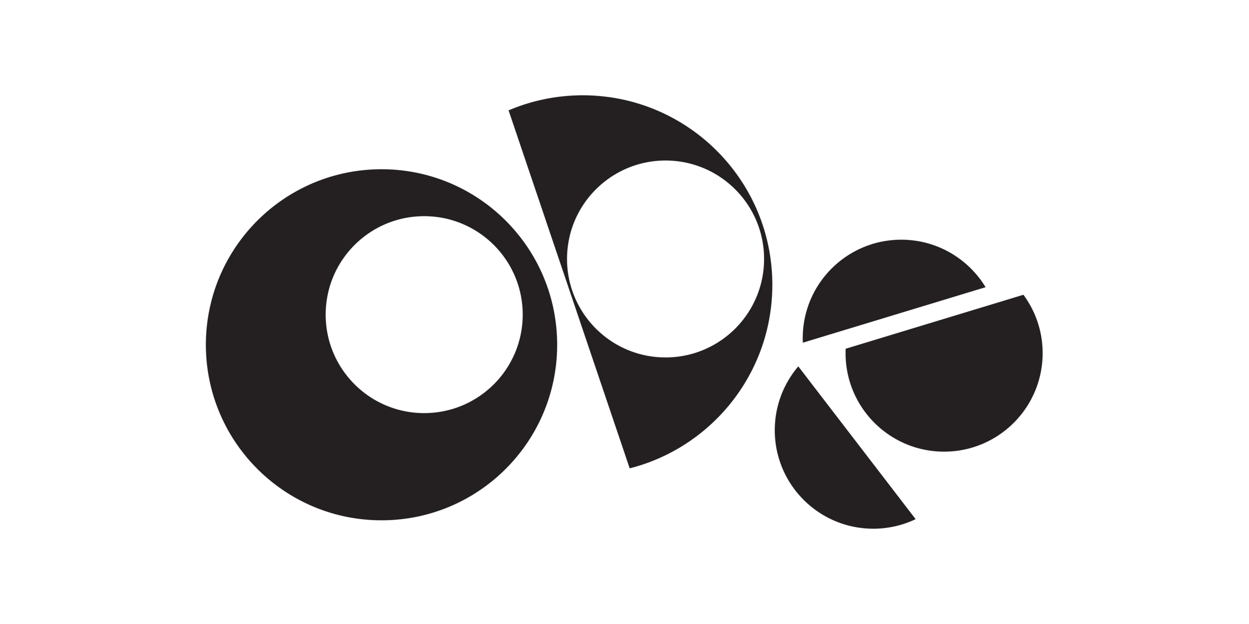
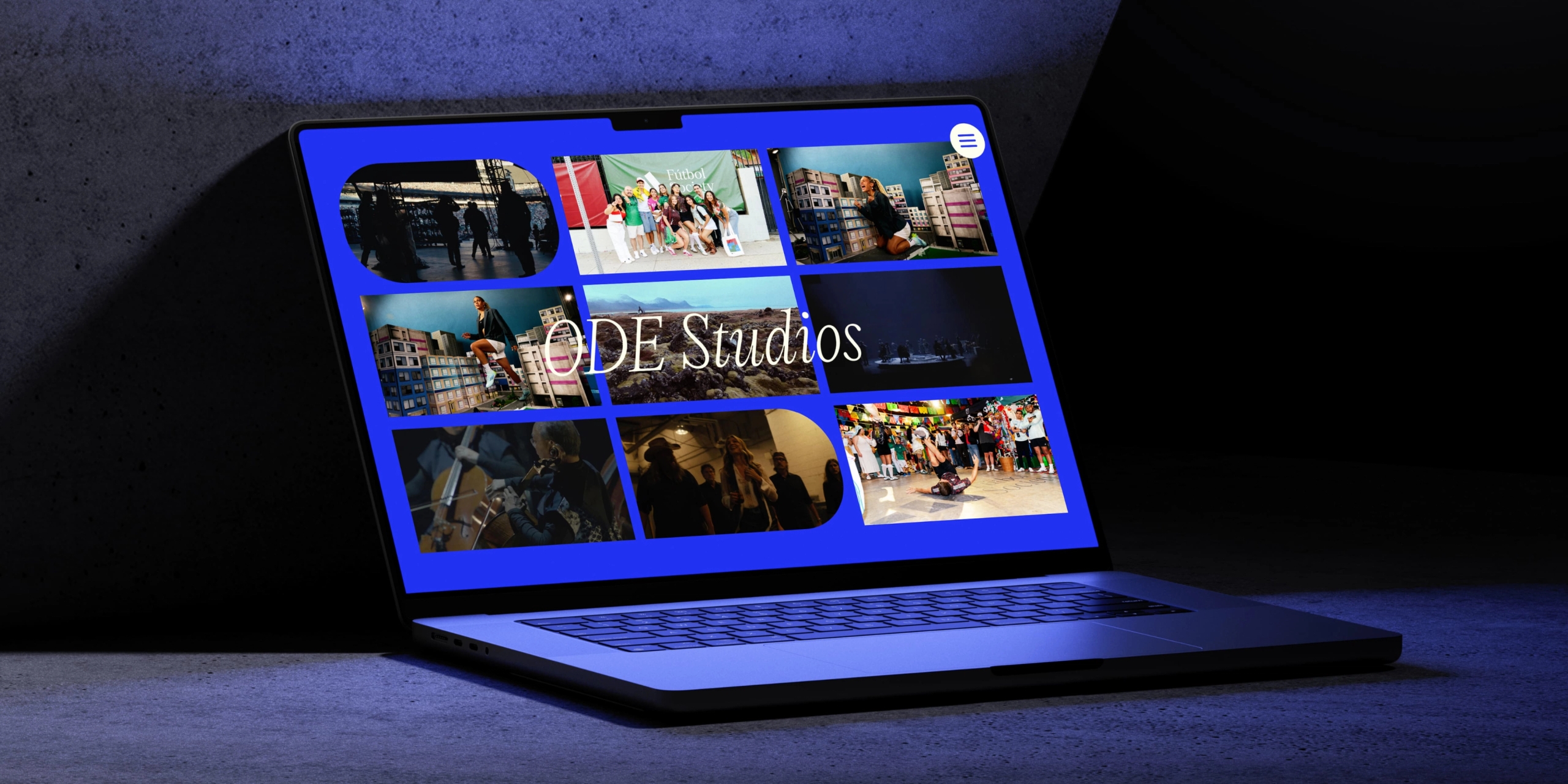
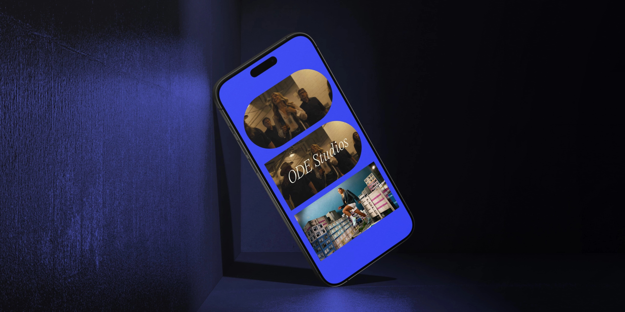
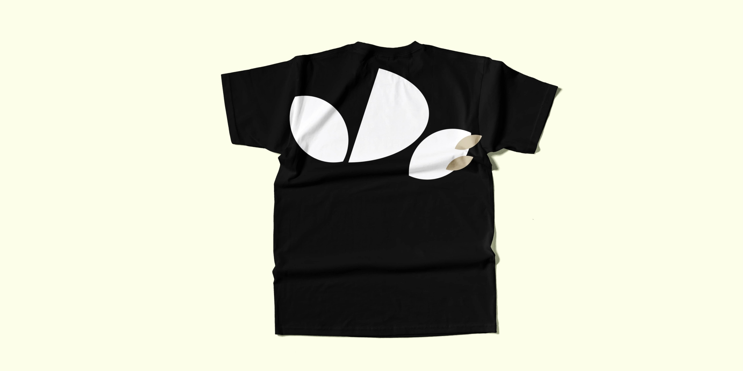
Our visual identity approach began with a collaborative process, using sketches and moodboards to shape a clear creative direction rooted in ODE Studios’ core archetypes, which we brought to light as part of our Group’s Brand Strategy work with the client. These archetypes informed our exploration of organic shapes, bold colours and layered textures to evoke connection, transformation, and curiosity. Two strong themes emerged early on: the geometric character of the ODE letterforms and the symbolic presence of the campfire, drawn from the brand strategy. We developed both through visual trials that combined structured and fluid forms, expressive type, and texture.
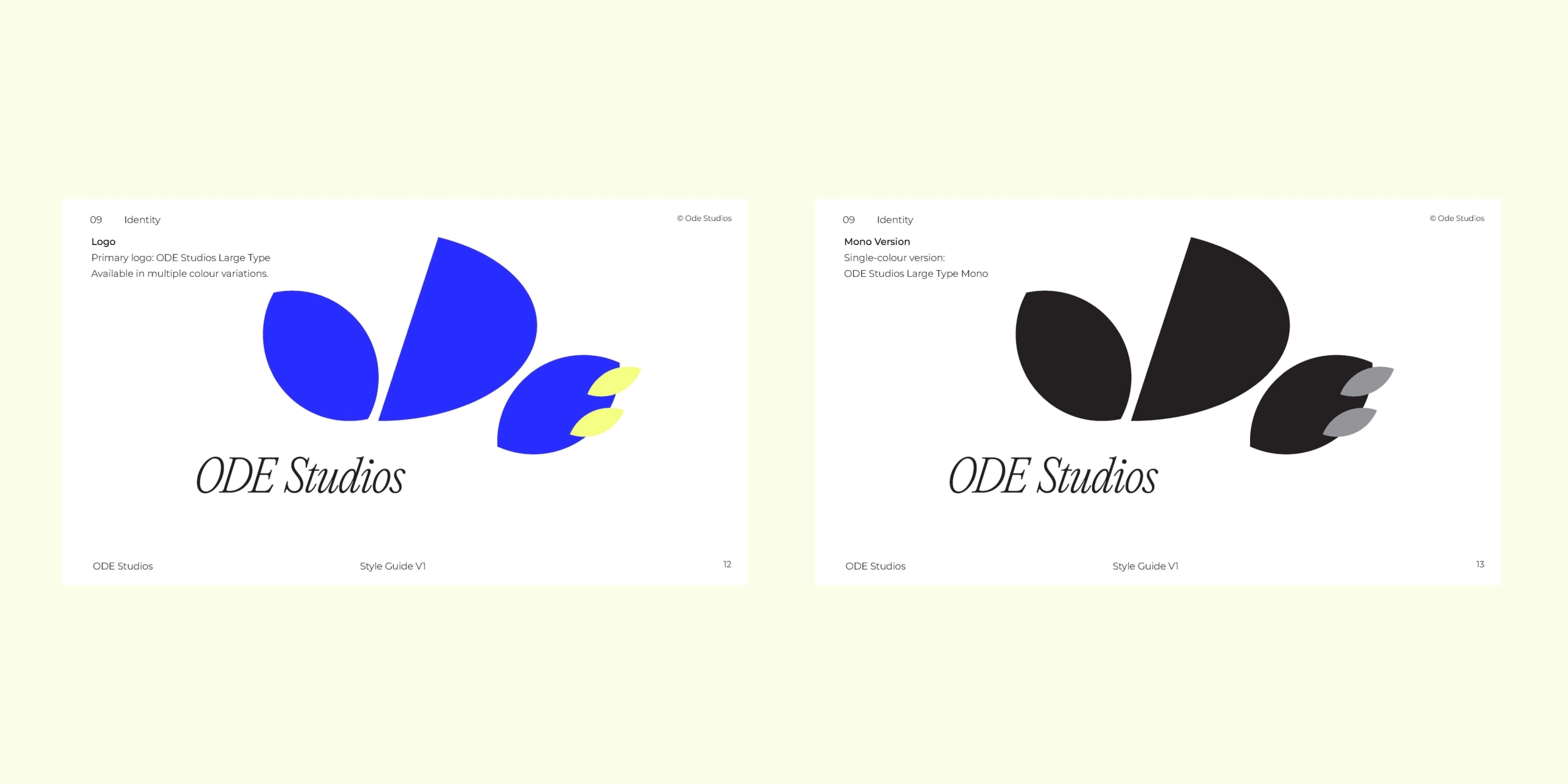
As the work progressed, feedback pointed towards a preference for more organic, dynamic interpretations of the ODE lettering—favouring playfulness over precision. This complemented the brand strategy work that brought a focus to ODE’s purpose and vision.

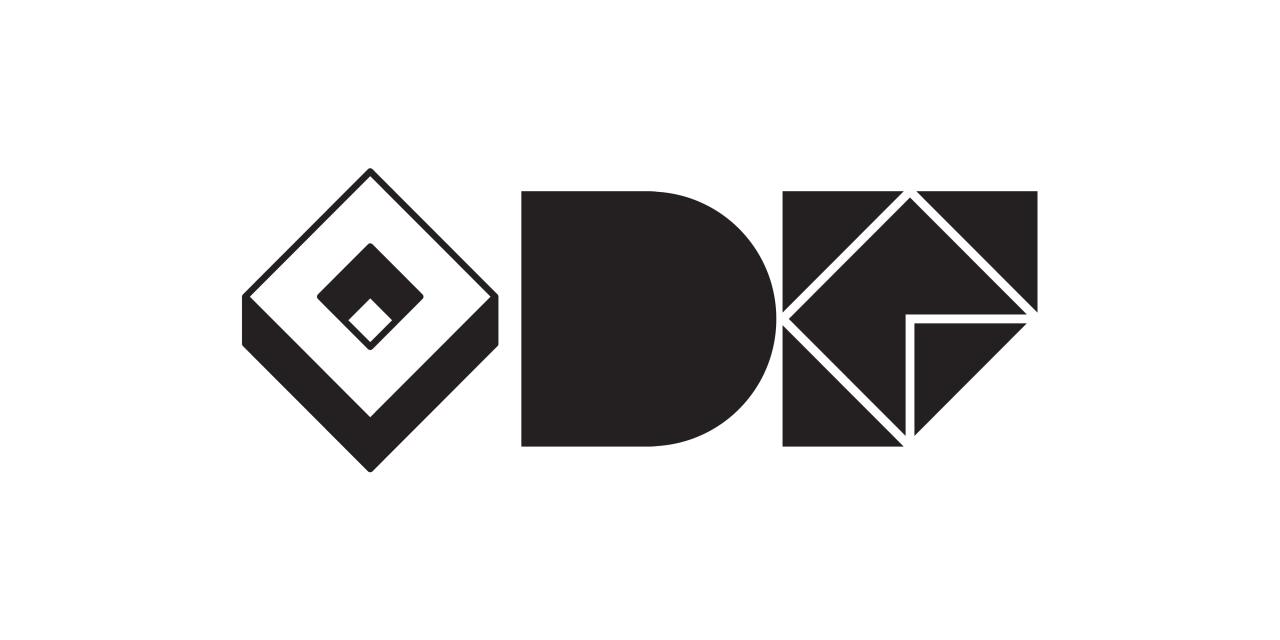
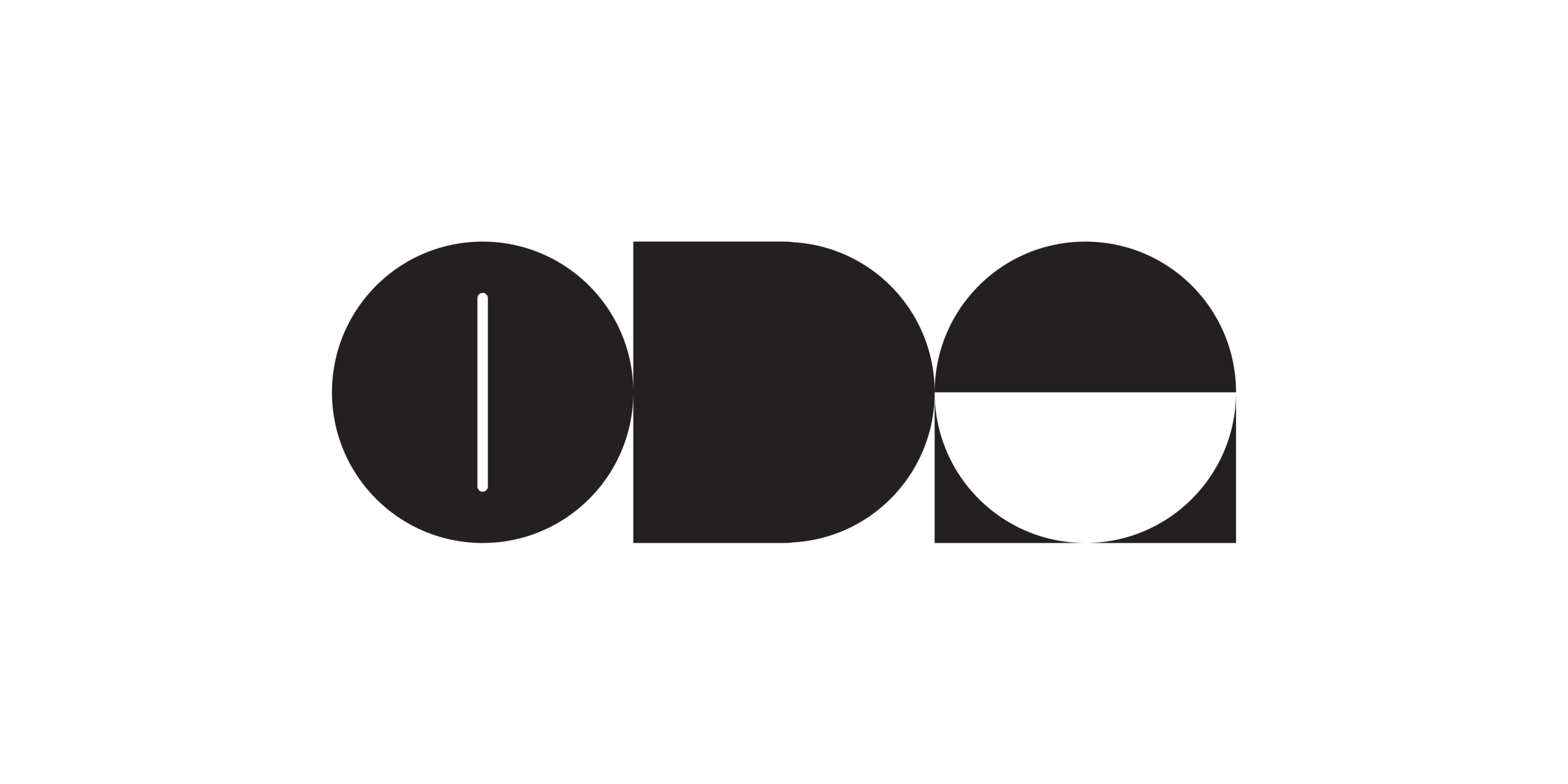

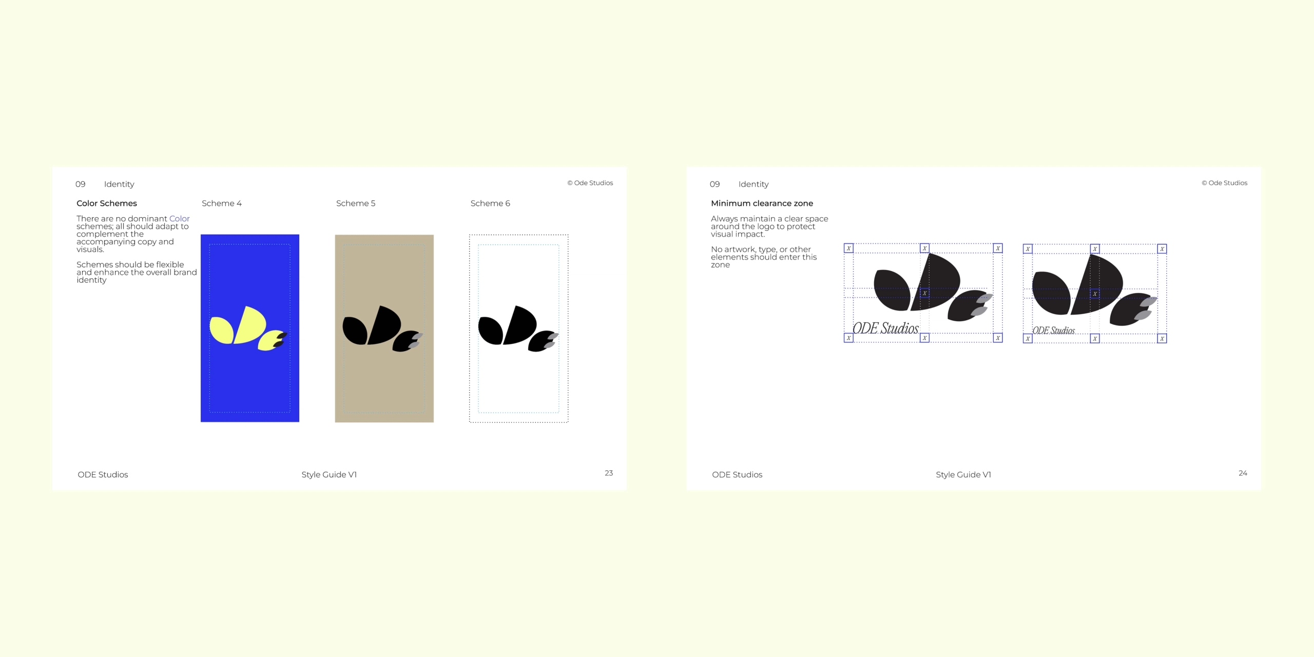
We recommended keeping the full range of initial explorations in use, offering flexibility across touchpoints. This reflects the team’s appreciation for identity systems, which embrace variation and modularity as part of their visual language.
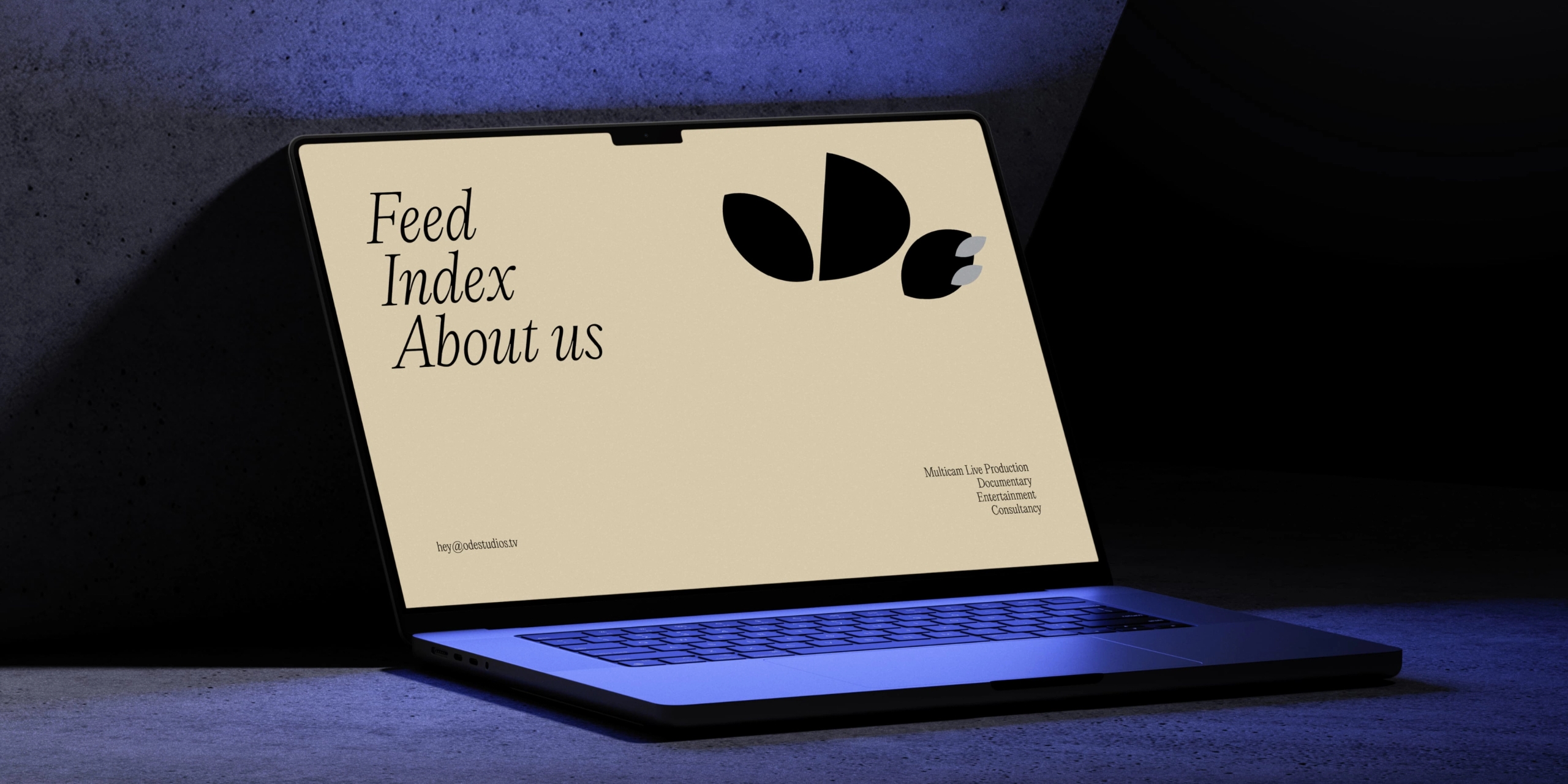
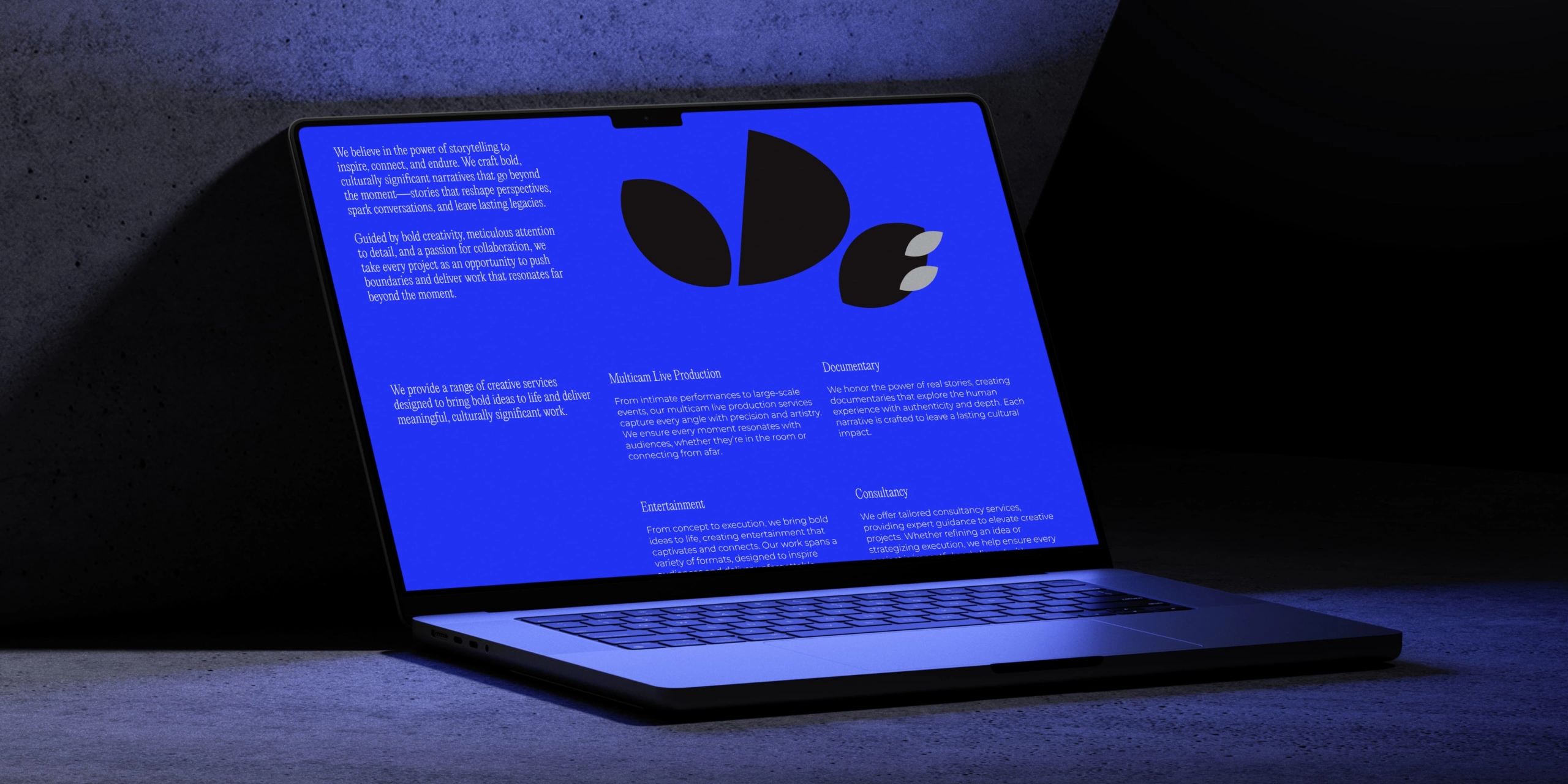
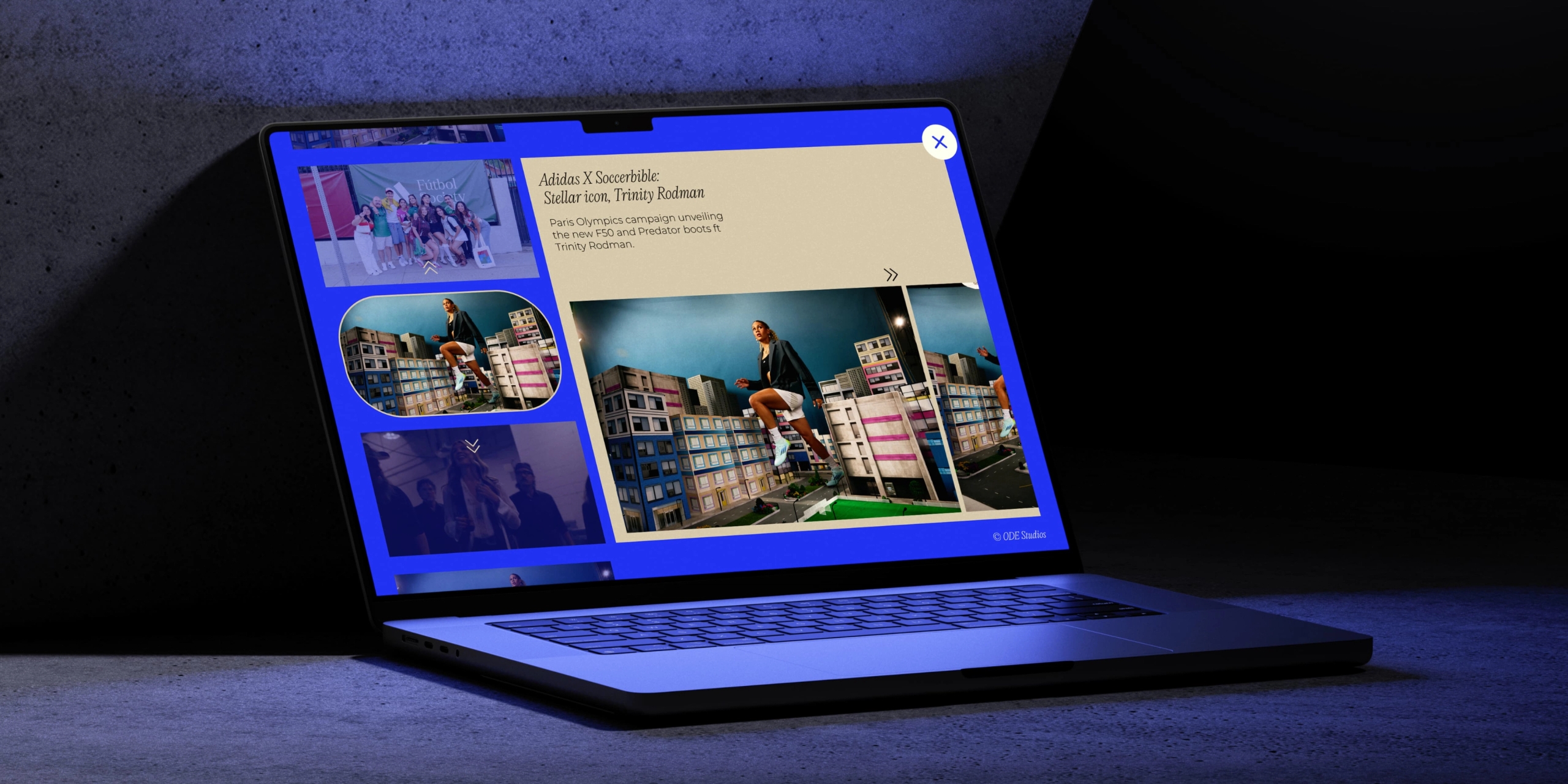
Our colour palette was deliberately limited, but vibrant, to strengthen recognition of the brand, across various different touchpoints, whilst still taking into account a need for accessibility and versatility.

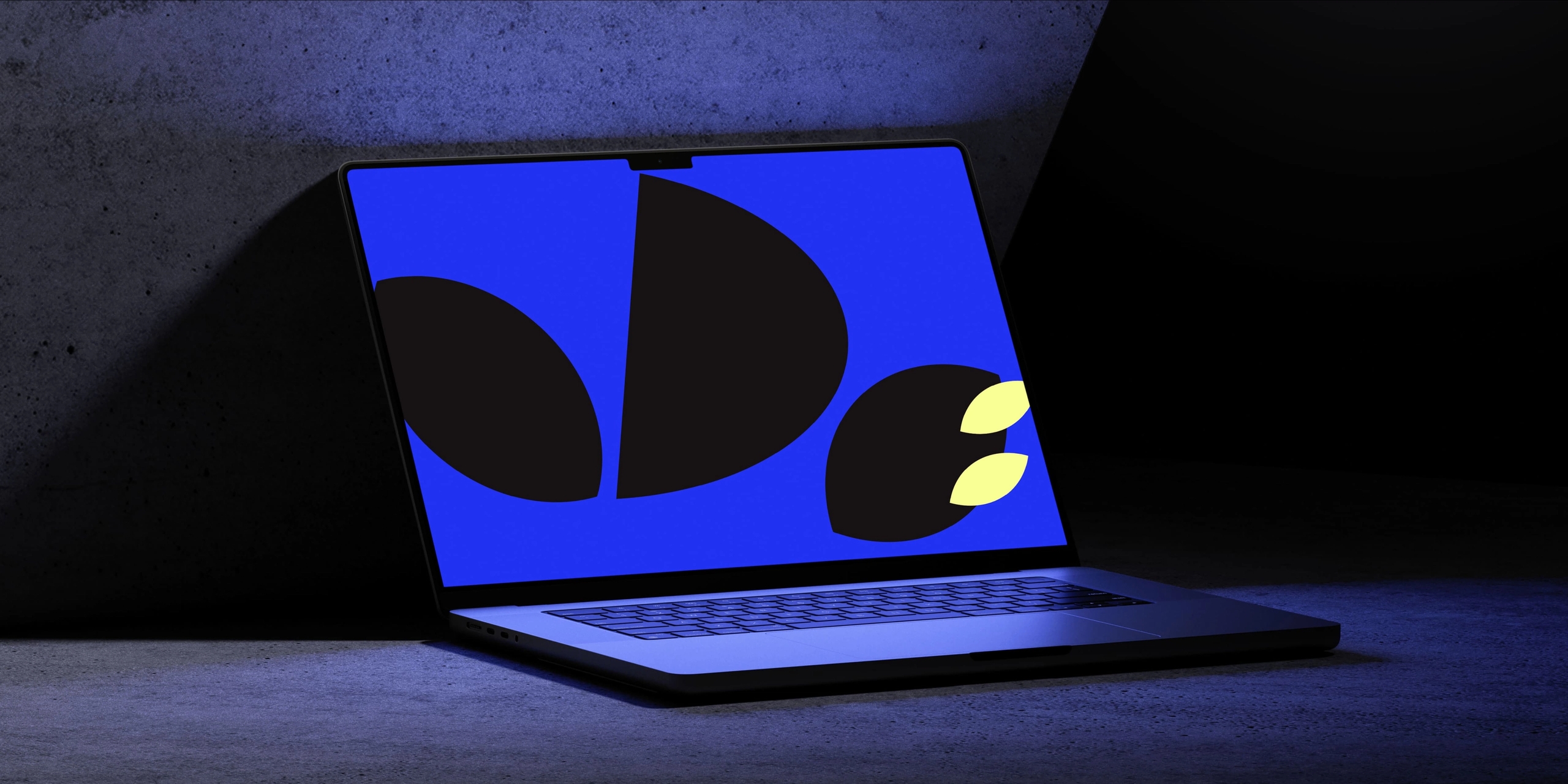
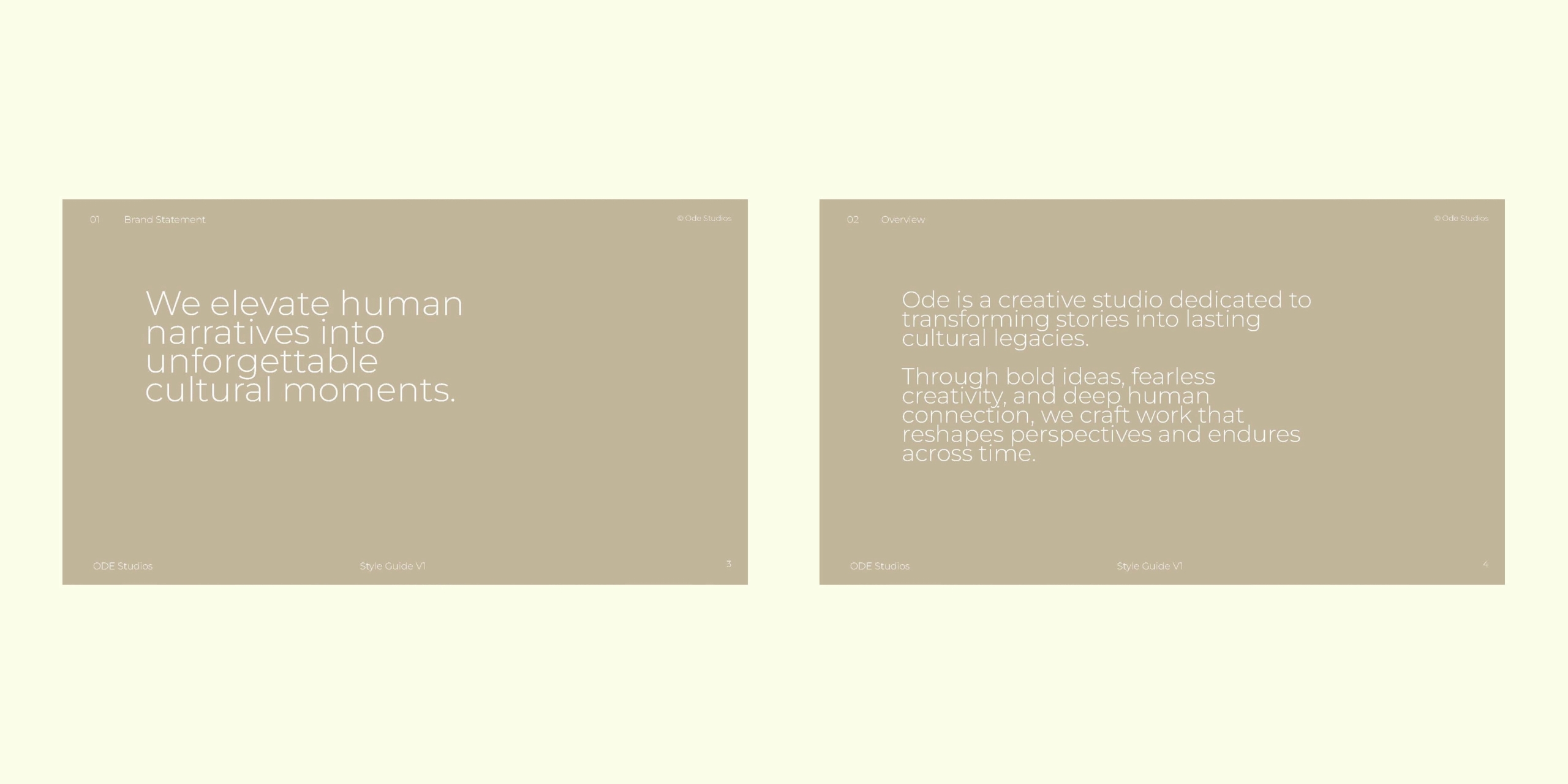
The Visual Identity produced is flexible and impactful, allowing ODE Studios to utilise it in multiple ways whilst retaining a cohesivity for their Brand that can be communicated visually through their storytelling and experiences.