Saucony
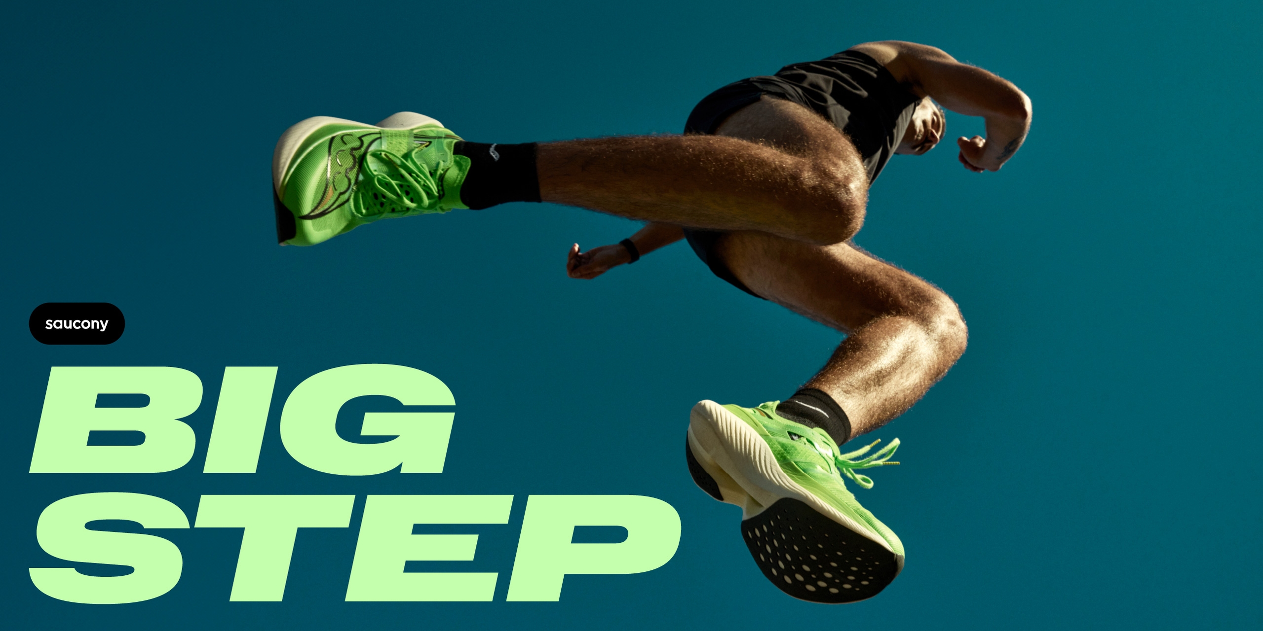
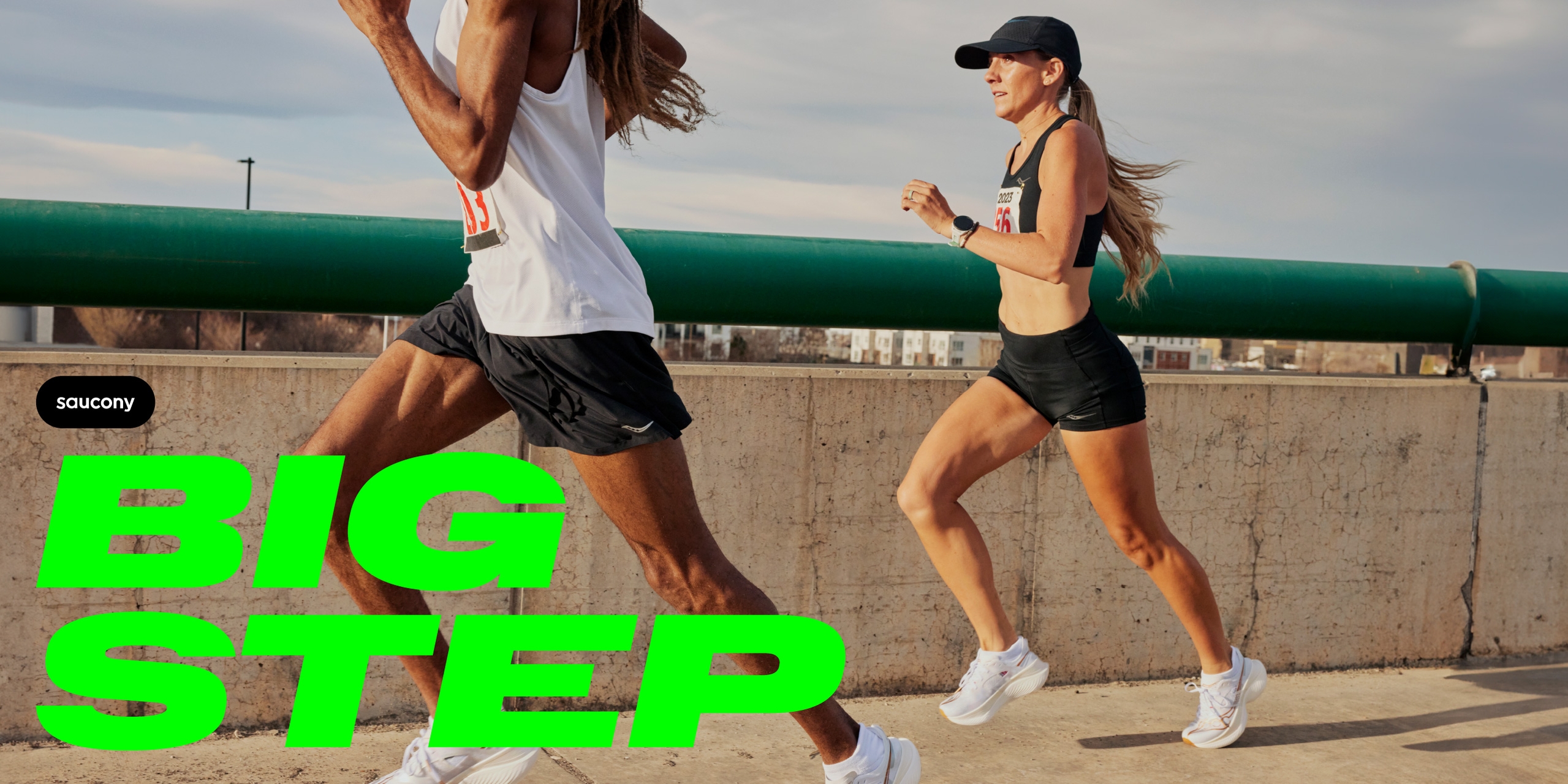
Big Step: Visual Identity
Creating a Visual Identity for Saucony that truly reflects the brand.
Since the summer of 2023 we have had an ongoing partnership with Saucony, working on their visual identity to bring an authentic reflection of the brand and its roots to life, whilst setting it apart from competitors.
By looking at their Personality, Tone of Voice, Brand architecture, the Typography and Colours used, we were able to breathe new life into the brand and provide Saucony a greater range of visual expression whilst retaining consistency.
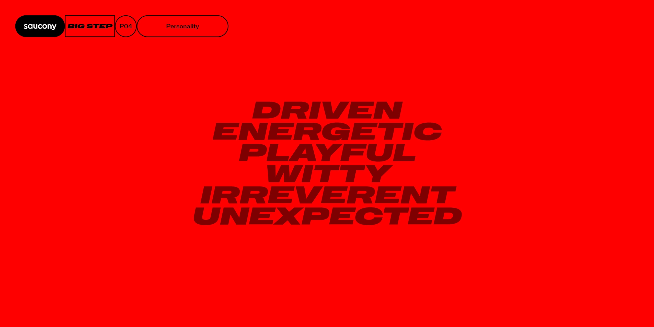
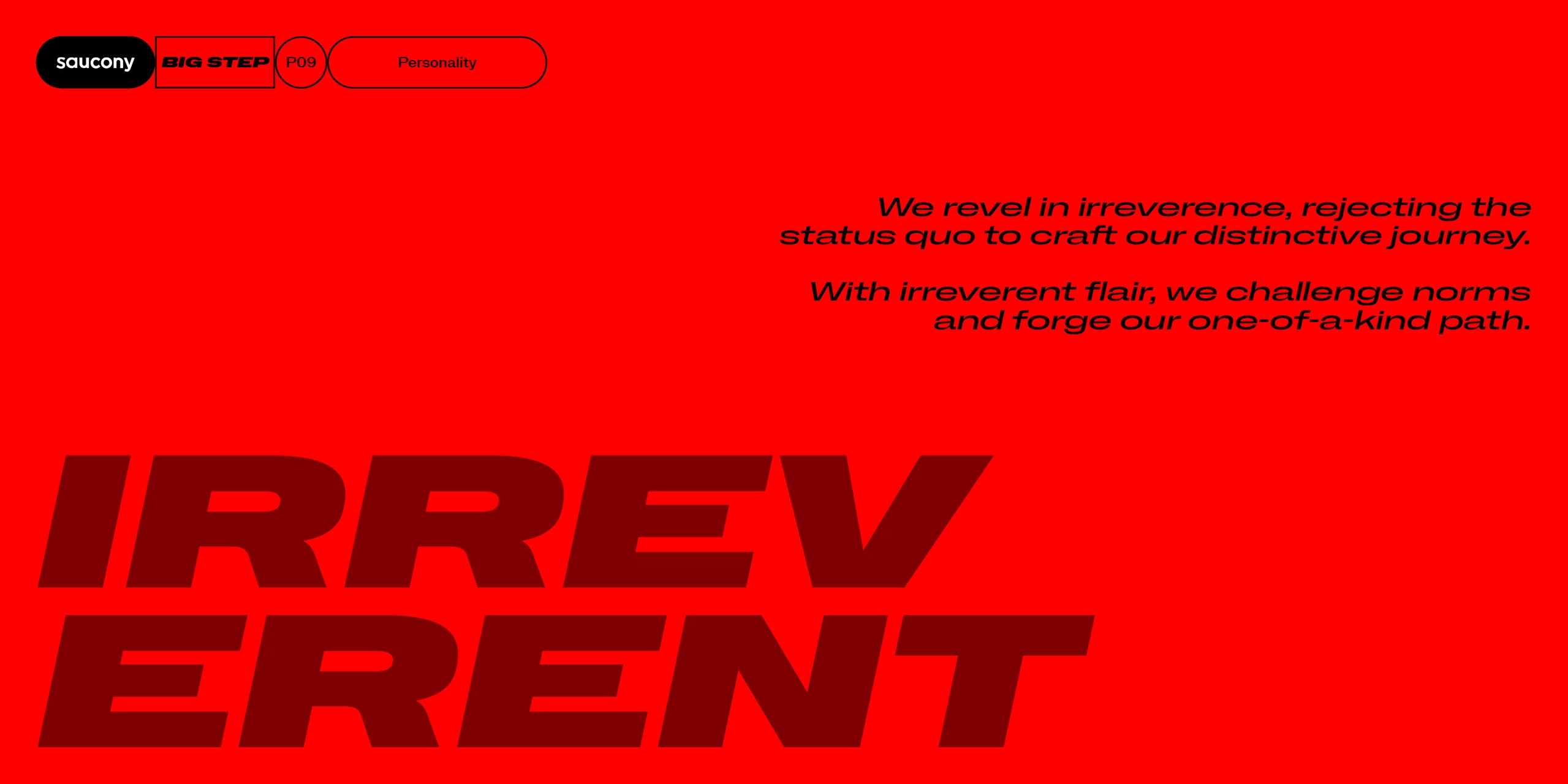
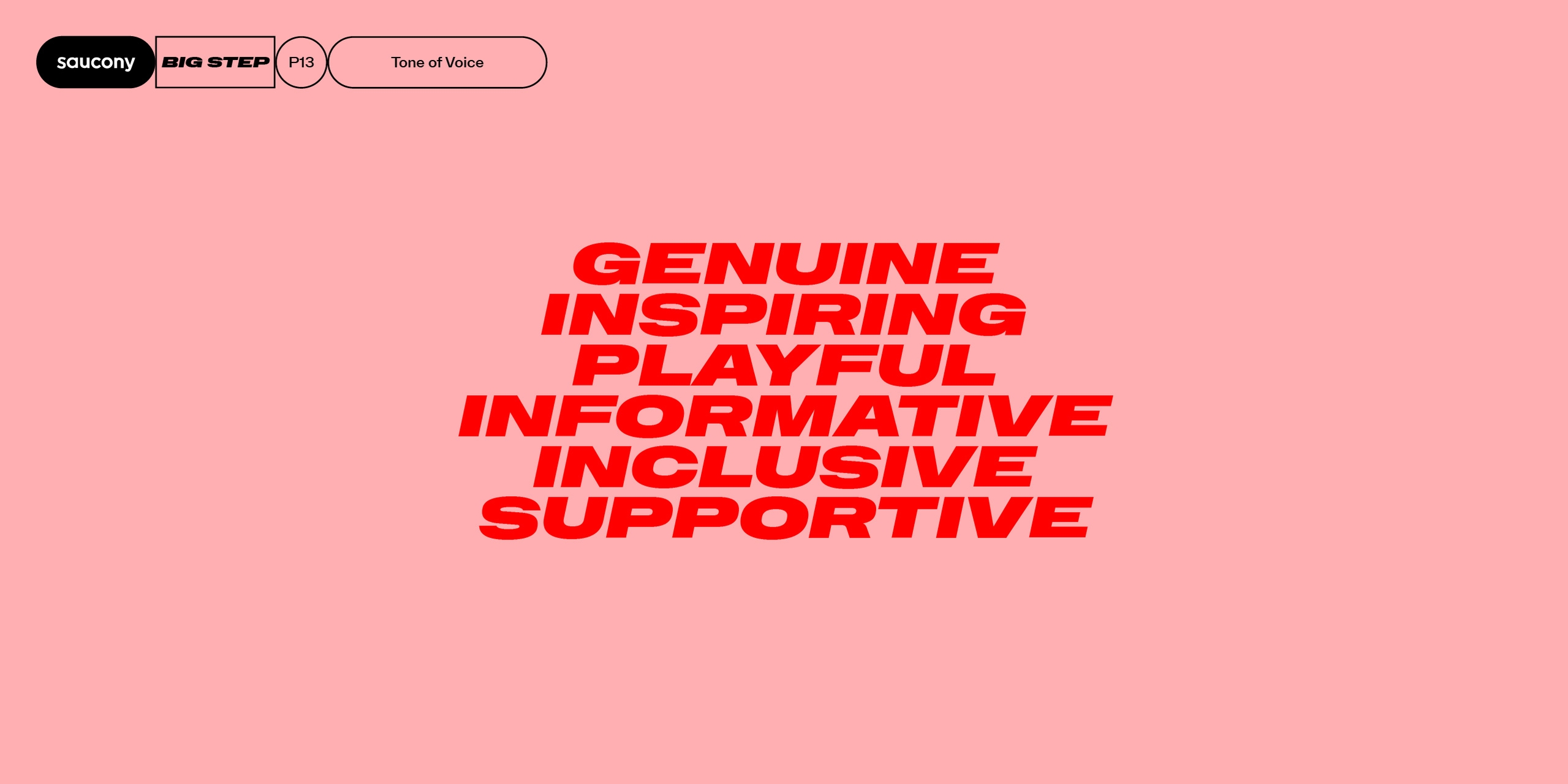
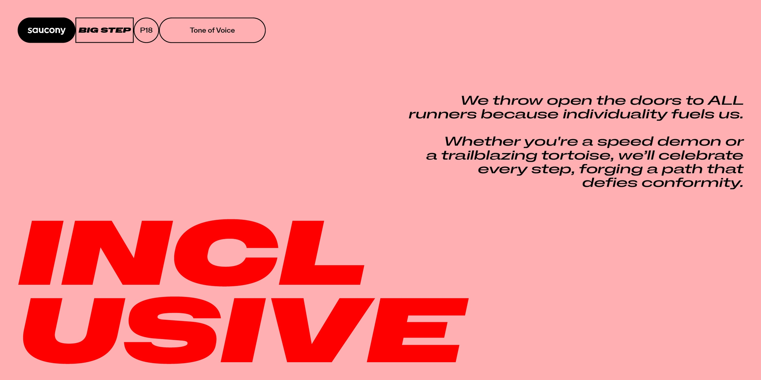
Saucony is a long established brand, with a big personality. They can be playful and tongue in cheek, and this was something we wanted to dial up in order to help them stand out. Aligning this bold personality with the right tone of voice was a crucial first step.
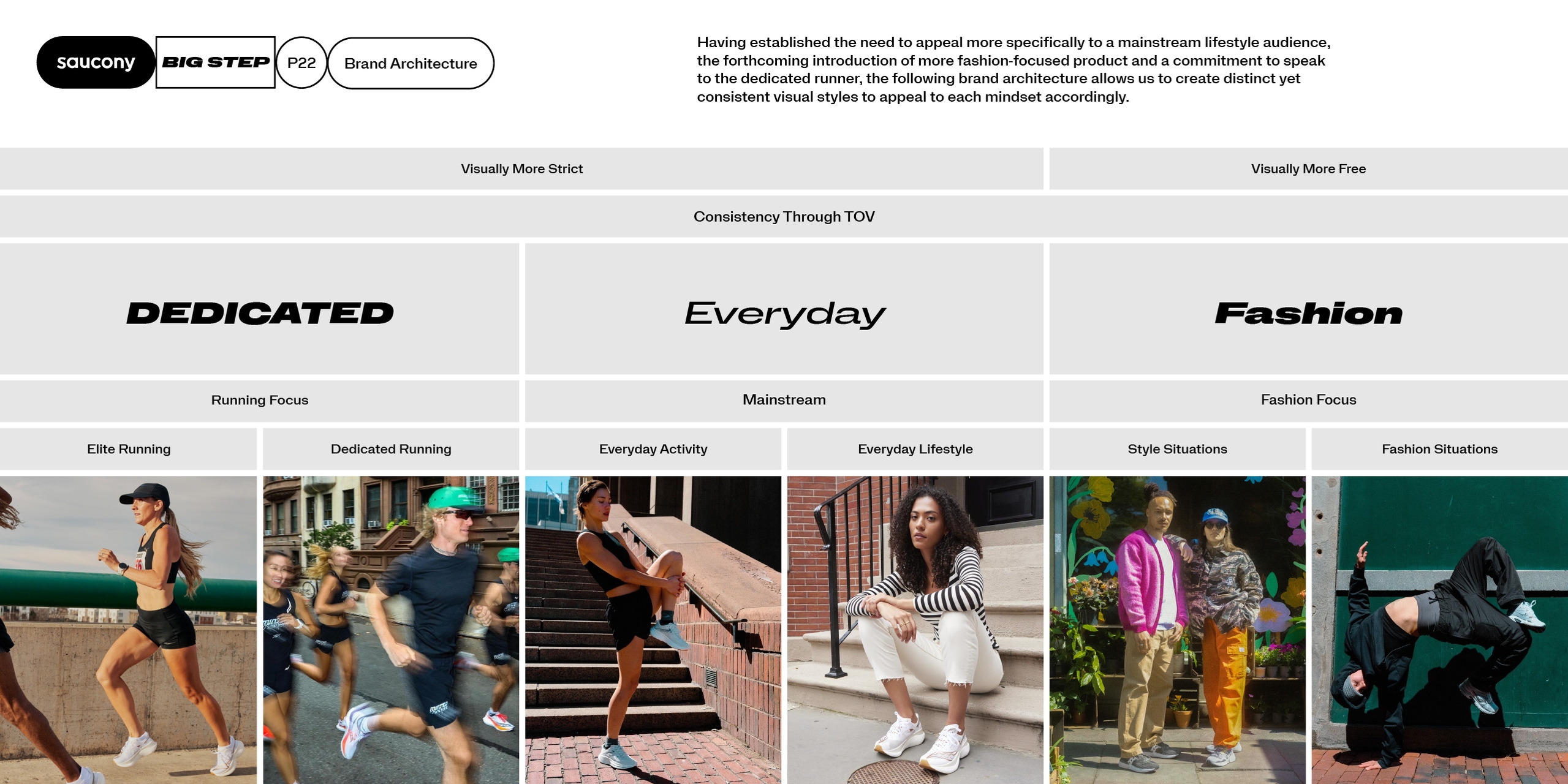
We created clear brand architecture for Saucony’s various categories that was implemented through photography, typography, colour and tone of voice suggestions. This work creates a distinct but consistent visual style across the whole range of products and communication.
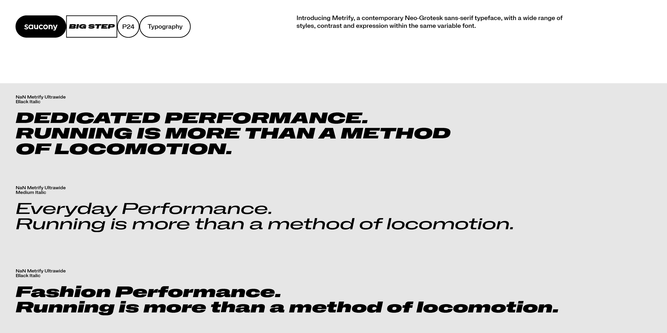
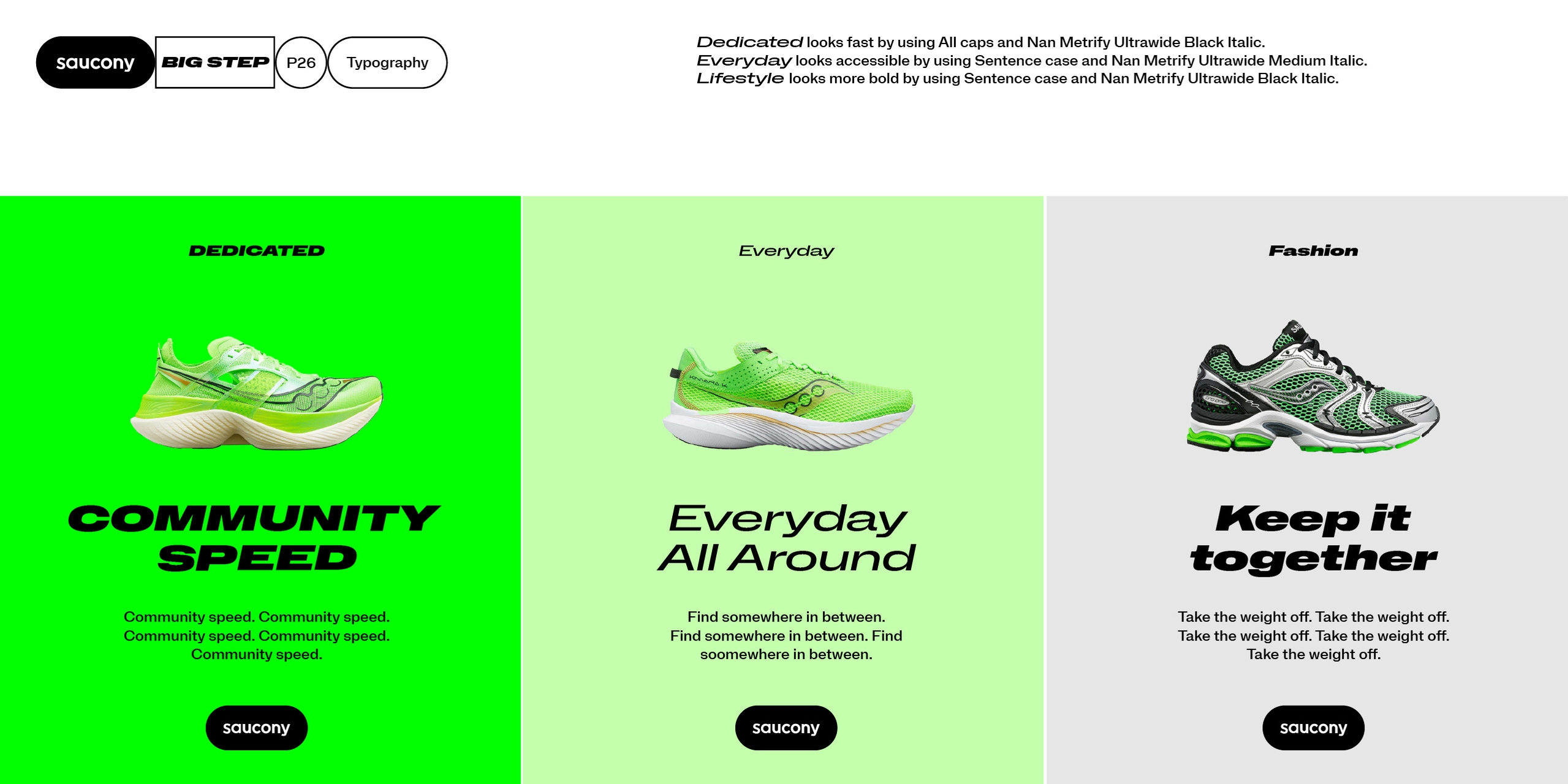
Using the font Metrify from NaN, a contemporary Neo-Grotesk sans-serif typeface gave us lots of options for Saucony and their different areas of retail. By varying the font application slightly, we could provide Saucony with a consistent visual identity that also spoke to their different audiences.
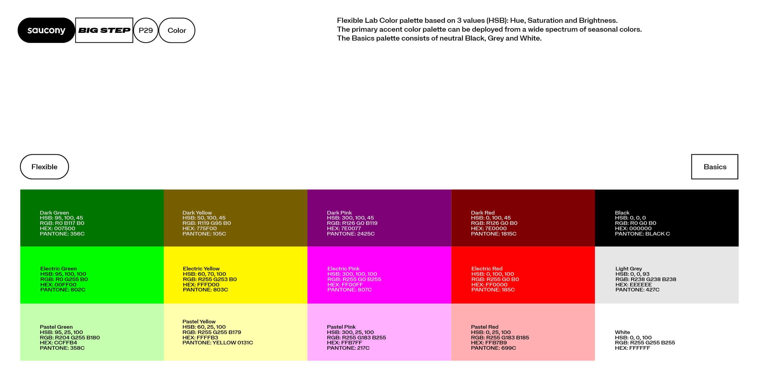
We created a colour system that allows both variety and consistency. Each palette features an 'electric' bright colour paired with a pastel and dark variation, simply using the brightness value. This approach means that seasonal colour palettes can be added, while keeping tonal consistency.
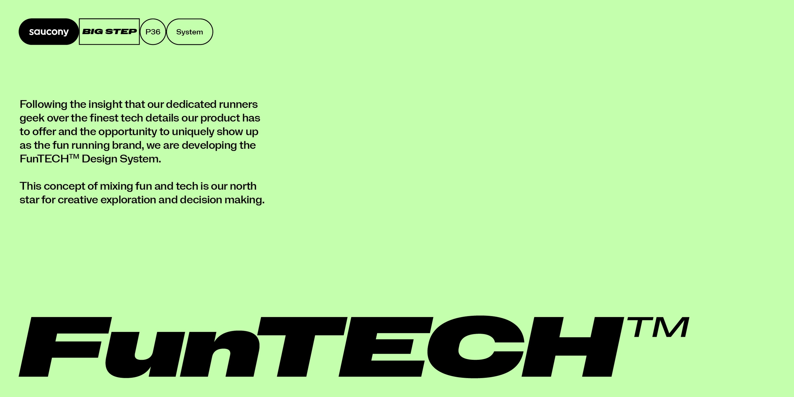
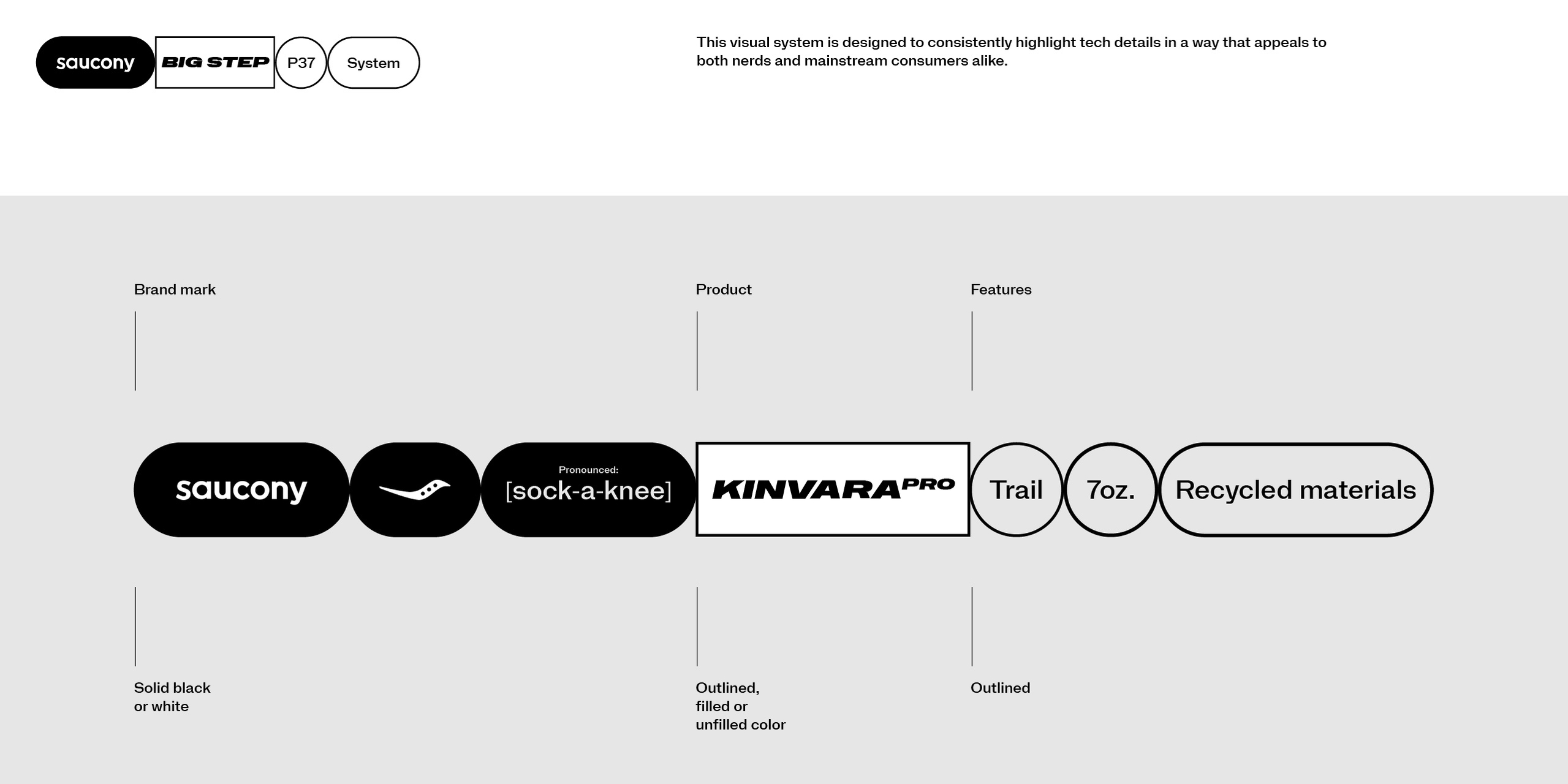
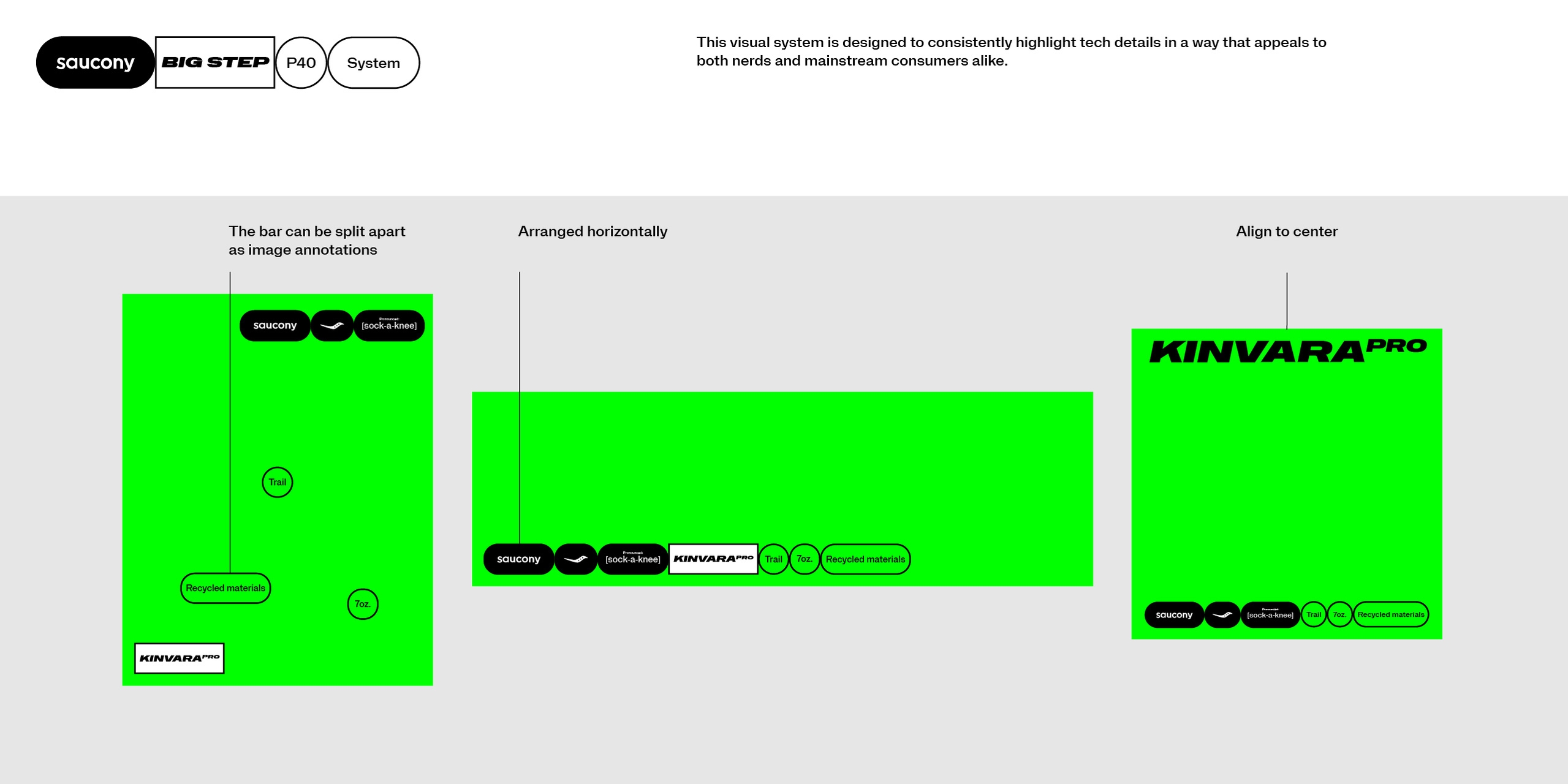
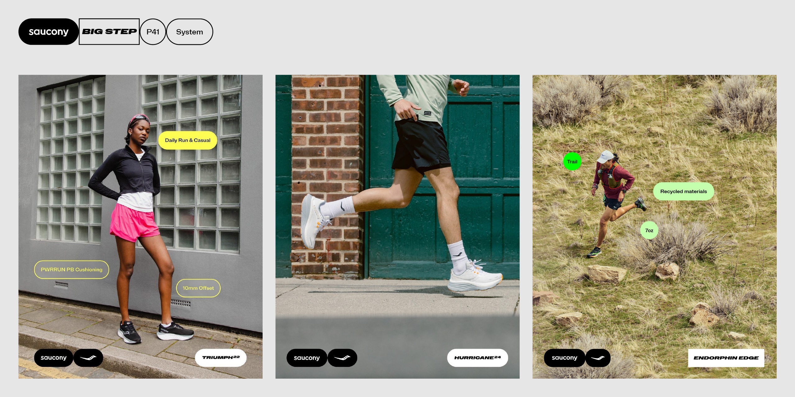
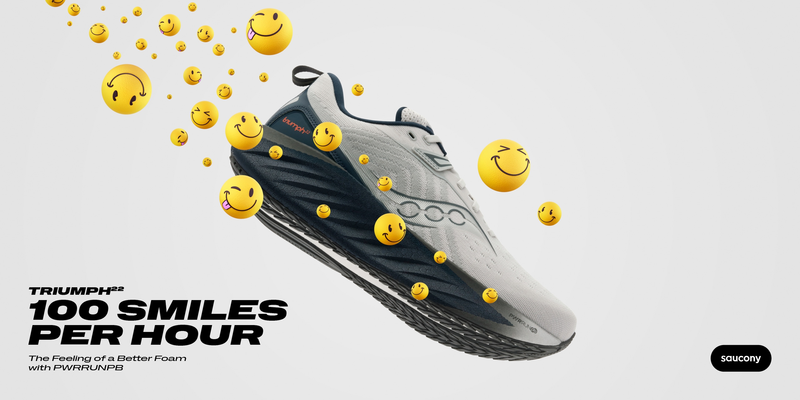
We wanted to build a system for Saucony that would help them show up with their full brand personality on display. The visual system we created, FunTECH, is designed in a way to consistently show technical details in an appealing way for the consumer. It's great to see this system in use by the Saucony team in their comms.
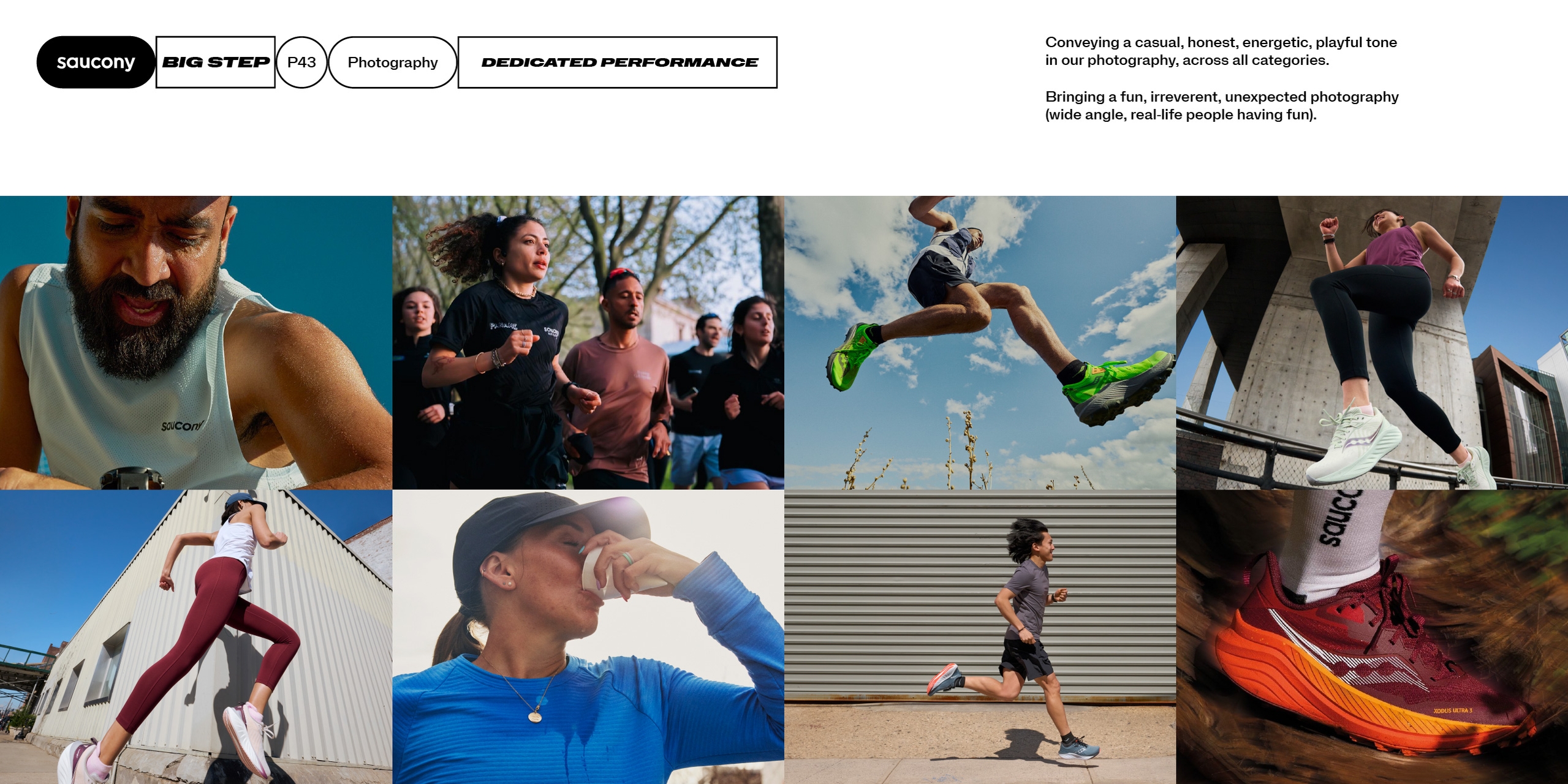
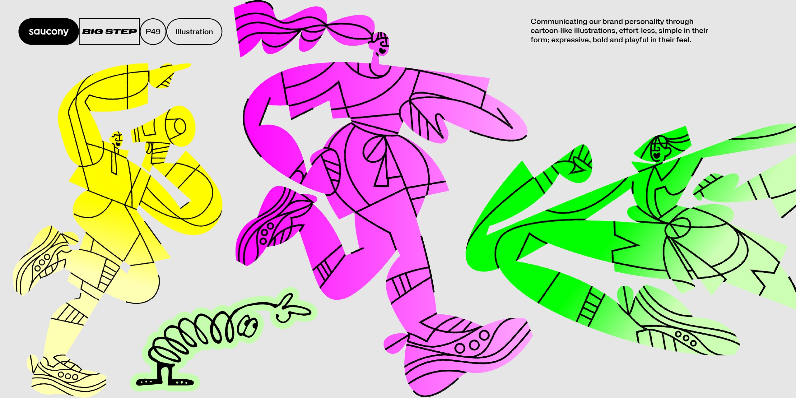
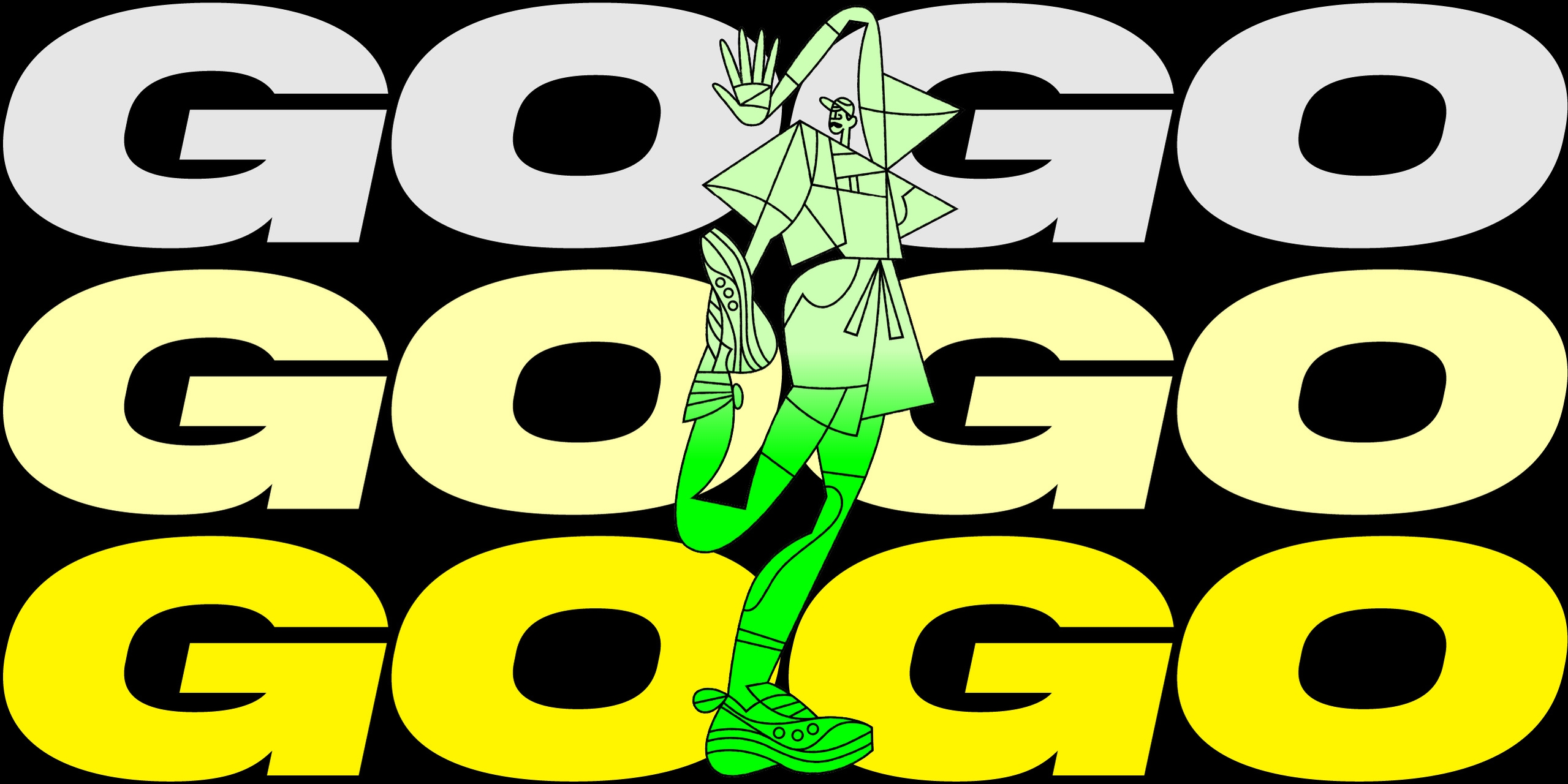
We developed guidelines for the art direction of photography and illustrations, with a consistent overall tone of voice but variations in style for different categories.
Conclusion
We have loved seeing our work roll out for Saucony, in a very impactful way. The brand has shifted and gained huge momentum in retail and communications, and we have forged a brilliant collaborative relationship with the team.
Credits
Metrify font by NaN
Illustrations by Meredith Schomburg and Elijah Anderson