AOPP
Art of Ping Pong
Ping Pong is good for you
2013 saw the birth of Art of Ping Pong, conceived by founder, ping pong enthusiast and friend Algy Batten. He set out to celebrate the popularity and sub culture of the game and fuse it with a passion for art, design and innovation. Vital to this vision was also a strong desire to give back and do good.
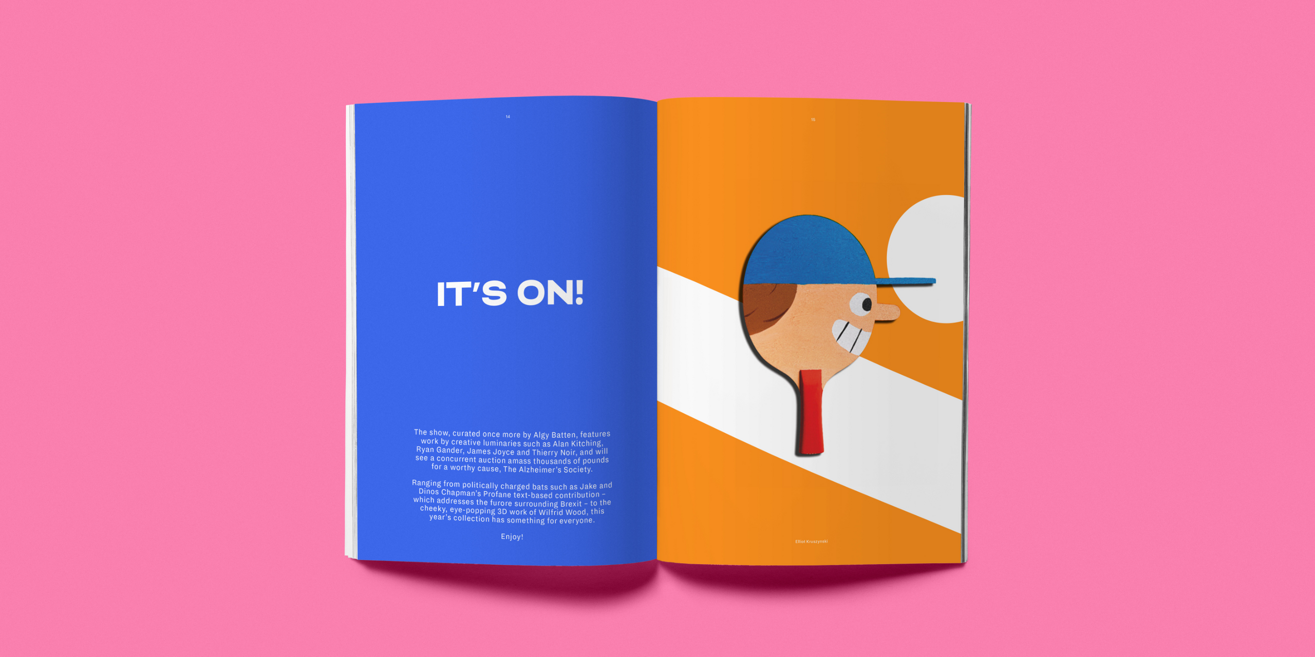
Alongside commercial endeavors, there is a heartfelt commitment to charity events and auctions where AOPP partner with a huge array of talented artists from across the world, producing hundreds of artworks and raising money for a host of great causes.

The spirit and style of work we had produced for the likes of Patta and Track Mafia is what inspired our collaboration.
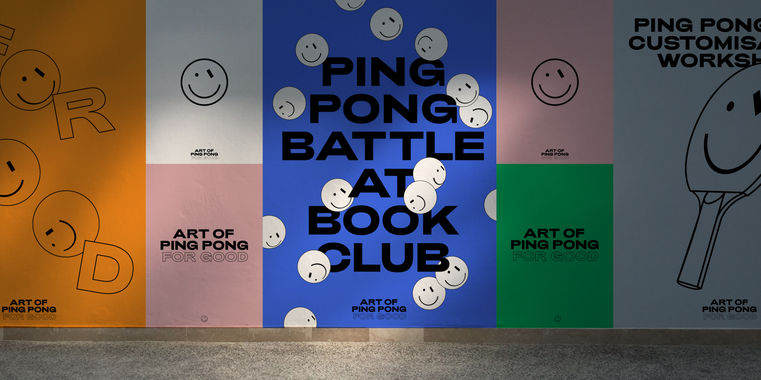
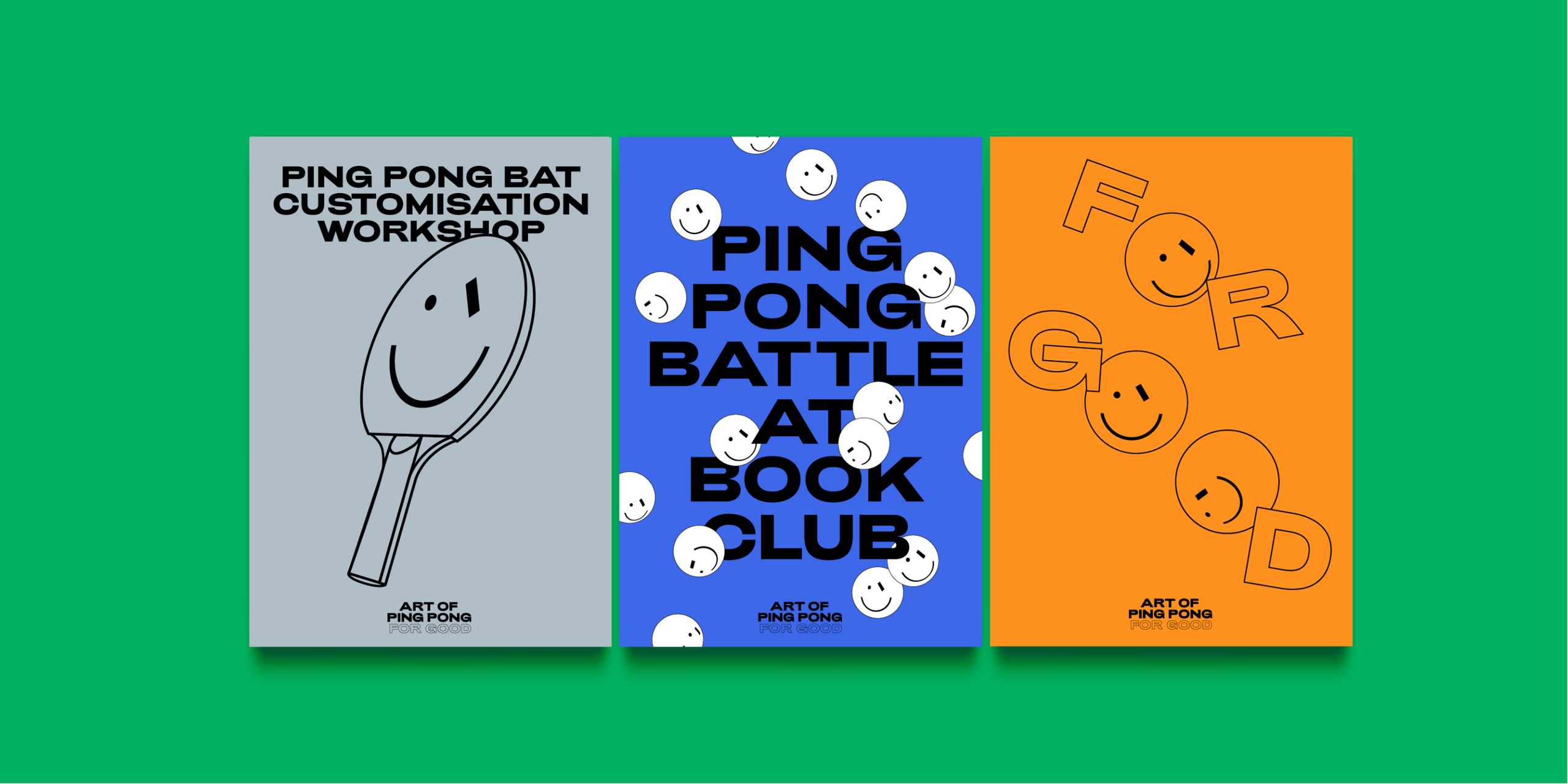
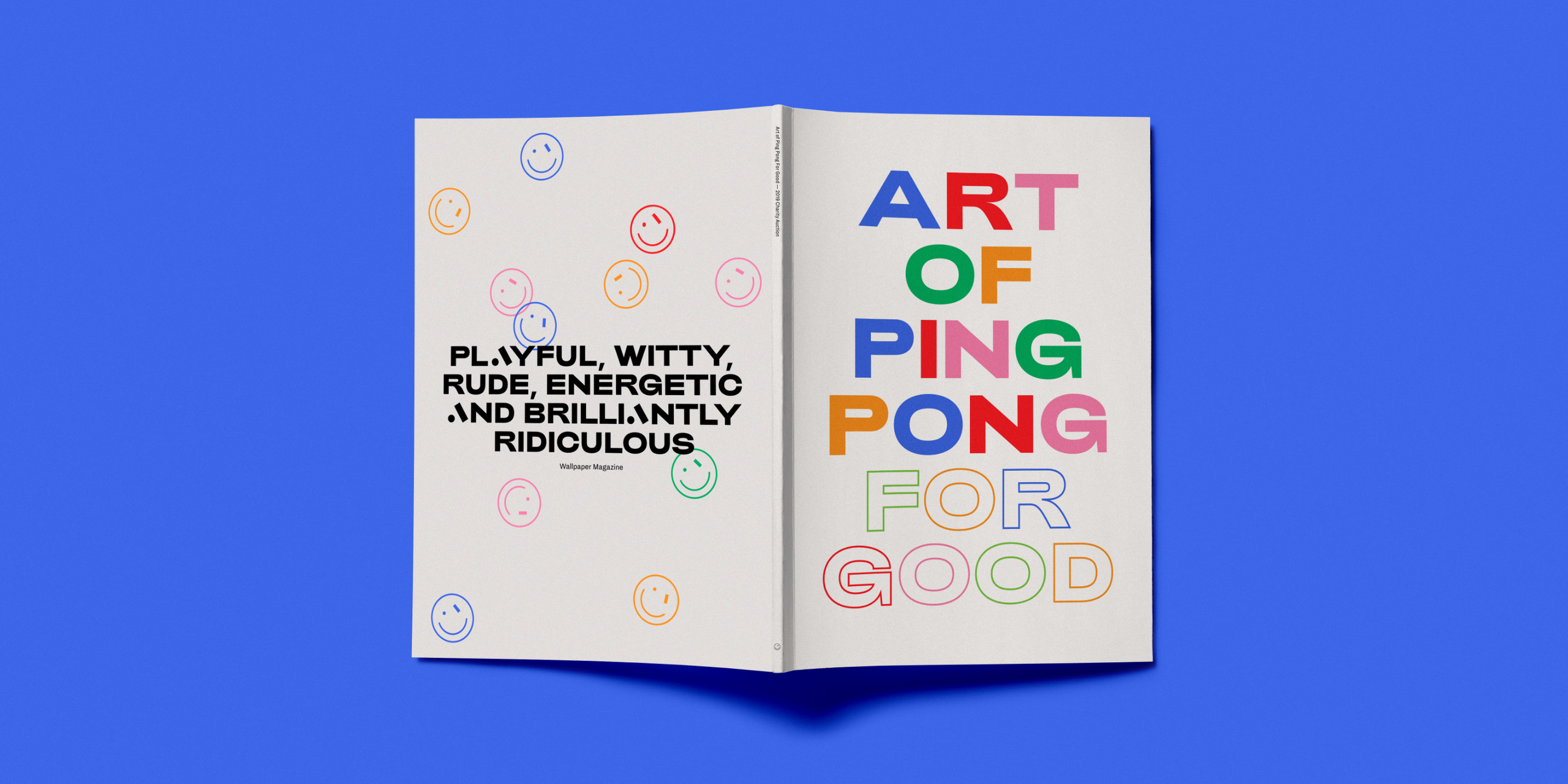
We teamed up with Algy to see how we could help further his creative vision for the brand, introducing its own complementary identity for it’s charitable endeavours - Art of Ping Pong for Good.
The springboard for the work was the main identity, developed by Studio Thomas and Algy. We furthered the identity to differentiate the charity side of the business while ensuring it retained all the fun, colour and vibrant charm of the Art of Ping Pong brand.
Using the main brand monogram we were able to build out the branding and introduce a contemporary typeface that works seamlessly alongside it.

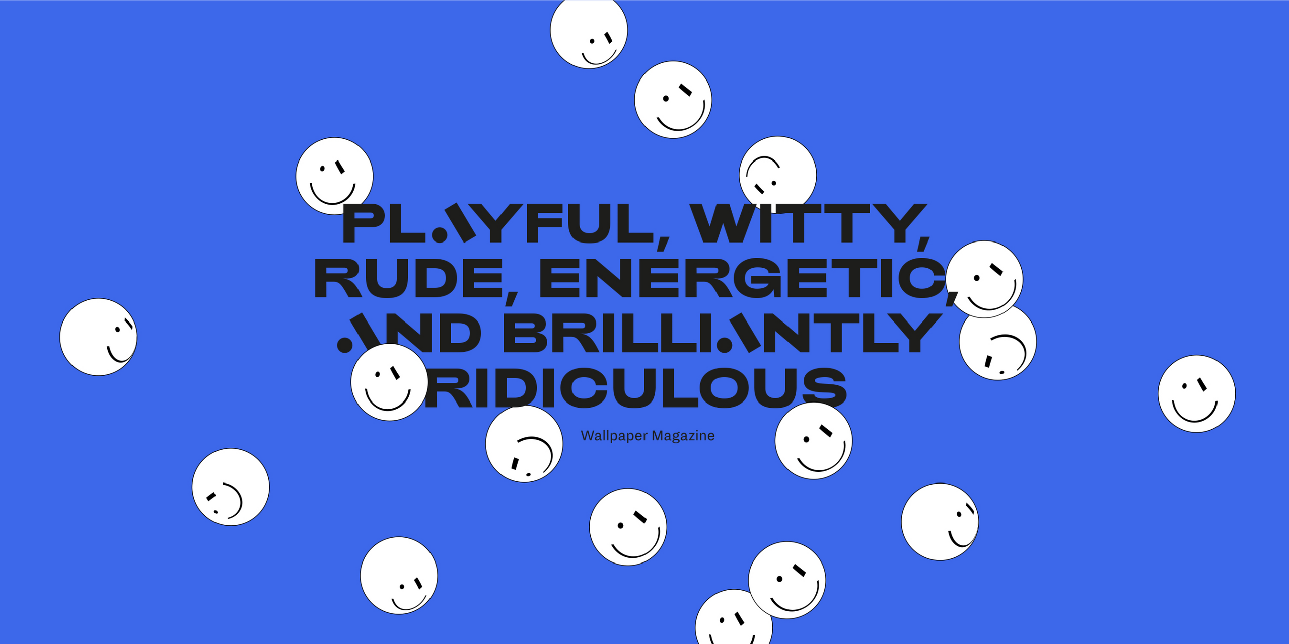
We were inspired to create a literal ‘face’ of the brand and to introduce a vibrant colour palette and attitude for its expression. A symbiotic relationship with the main brand identity allows Art of Ping Pong For Good to stand on its own two feet.
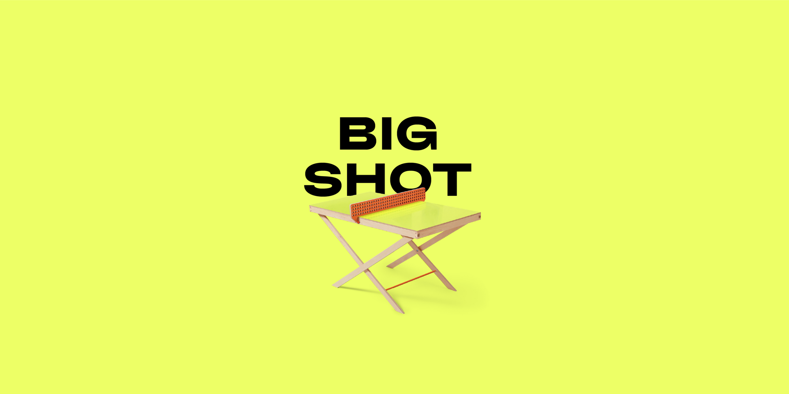
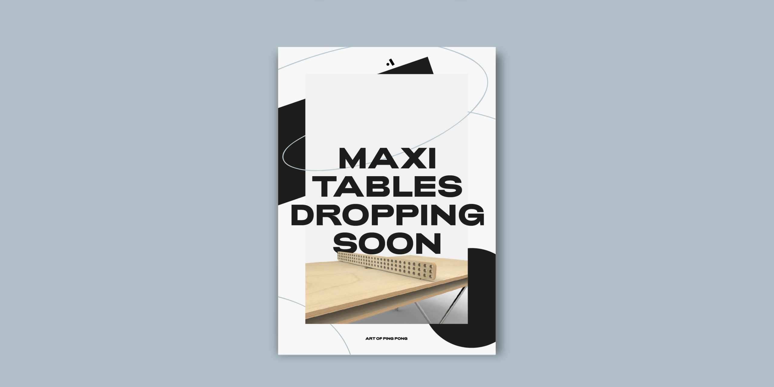
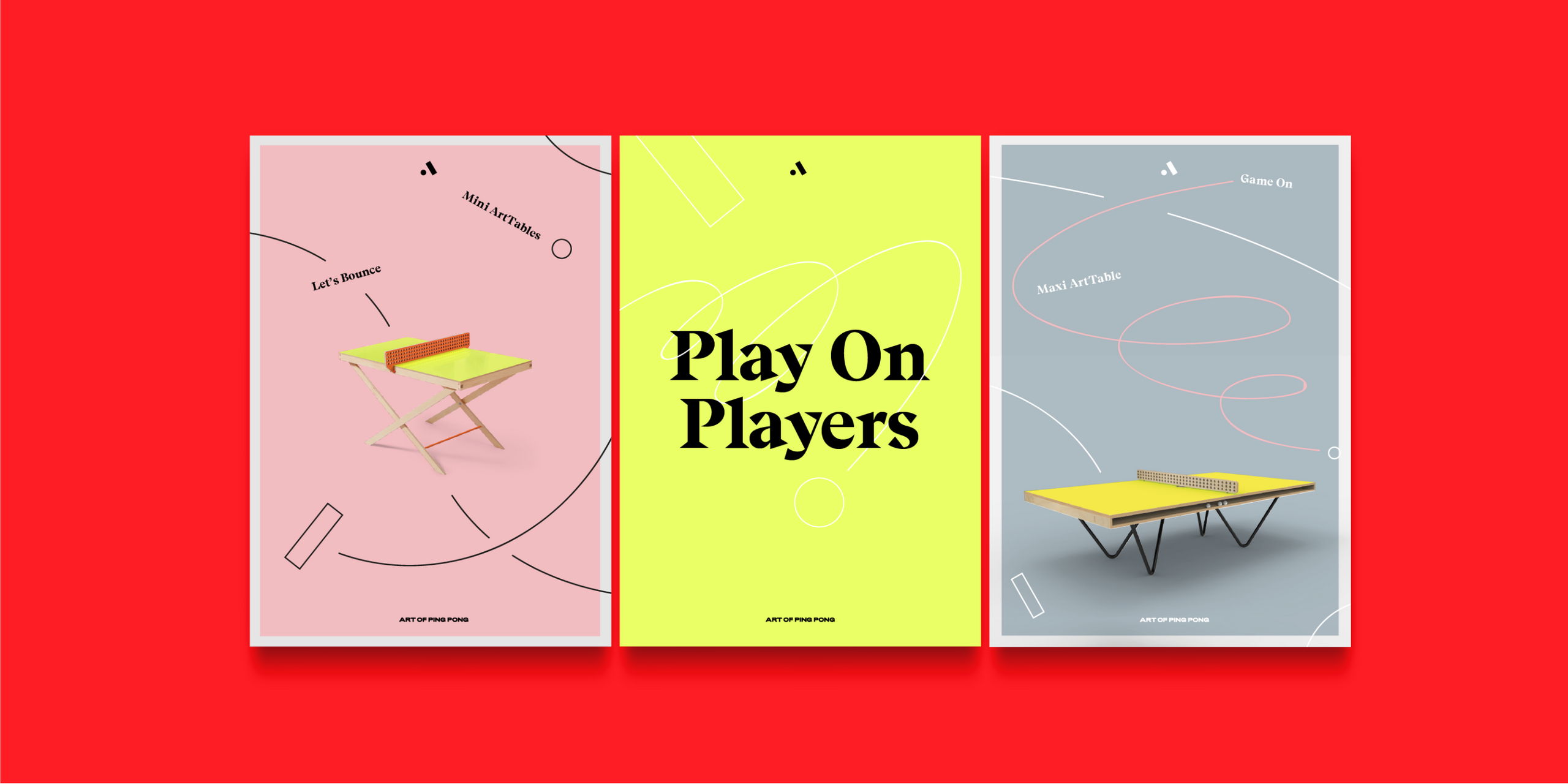
We extended the main Art of Ping Pong identity for commercial use, supporting new product launches for example. With the imminent drop of new Maxi Tables and the introduction of the Mini Art Tables, we were able to include a secondary typeface and loose gestural marks, that mimic the path and bounce of a ball in play.
We allowed for flexible interpretation of the brand identity, and incorporated a suite of colour pallette options. This ensures the brand always feels bright and innovative in it’s articulation. Colour cues from table tops or artworks themselves can be used to create colourful bespoke materials.